


Finding ways to boost conversions — getting more users to take a desired action — is essential for increasing your online business’ revenue.
There are two main ways to get more conversions:
- Increase visitors’ motivation to complete an action, which is typically done by refining your copy and testing new offers.
- Make it easier for them to convert by reducing friction, which is typically done by analyzing users’ behavior to find friction points.
Many teams start by putting most of their efforts on the first category by refining their call-to-action buttons (CTAs), adding pop-ups or live chat, and implementing other best practices that may or may not actually increase visitors’ motivation. But if you have a working website or app, it’s likely that your conversion rates (for both micro-conversions like newsletter signups and macro-conversions like product orders) are already being affected by user experience problems.
That’s why the smart way to start getting more conversions is to focus on reducing friction by analyzing your users’ current behavior. Instead of blindly following generic tips, analyzing users’ behavior will help you find the friction points that are preventing them from converting. Once those are fixed, you can test and evaluate other ideas for increasing user motivation.
To help you out, this guide contains 19 proven tips for boosting conversions, split into two categories:
Most of the ideas can be applied by almost any online business, but a few are tailored to e-commerce stores and SaaS apps.
In the end, we’ll also discuss the importance of A/B testing for increasing conversions.
Before we dive in, a quick (but important) note about “good” conversion rates.
What is a good conversion rate?
One of the most common questions on the topic of improving conversions is “What’s a good conversion rate?”
While many industry reports talk about “average website conversion rates,” these are likely irrelevant to your business.
Even in the same industry, websites have vastly different conversion rates due to factors like price, incentives to buy, page copy, marketing strategies, target audience, and more. For example, a good conversion rate for an e-commerce business that sells high-margin products and doesn’t ever offer discounts might be horrible for another one that sells affordable products and constantly runs discount campaigns.
Plus, conversion rates aren’t static. They fluctuate constantly as businesses try different conversion rate optimization (CRO) techniques and face various user experience problems.
That’s why an “average” or “good” conversion rate for your industry (or even for your competitors’ sites) is a poor way to set targets for your business. Instead, use your current conversions and conversion rates as benchmarks and try to improve them each month with the tips in this guide.
How to find and fix friction points that reduce your conversions
In this section, we’ll start by showing you how to analyze your users’ behavior with Smartlook and uncover what’s stopping them from converting in the first place.
Specifically, tips #1 through #7 provide many ways to find friction points and low-hanging fruit for getting higher conversion rates.
Quick note: Try Smartlook’s full-featured, 30-day trial (no credit card required) or our free public demo to get a better understanding of how to implement these tips in practice.
#1 Get an overview of the typical user’s experience with heatmaps
Heatmaps are a great starting point for analyzing visitors’ behavior. They track how users interact with a webpage or app screen, while also being easy to create and read.
Most heatmap tools (including Smartlook) support three types of heatmaps — click maps (left), move maps (middle), and scroll maps (right).
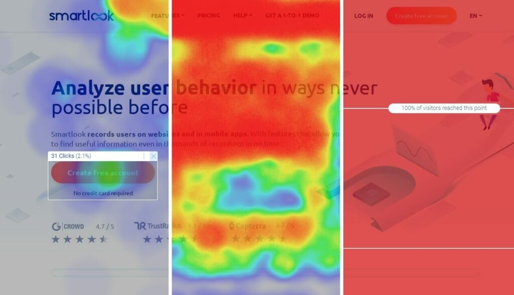
For example, here’s how each type of heatmap can help you:
- Click maps show where users click, so you can determine which CTAs they interact with the most.
- Move maps show where users move their cursors, so you can see which elements draw their attention.
- Scroll maps show what percentage of users reach each part of a page, so you can see what percentage of them see important page elements.
Sewio used heatmaps and found that many of their website’s visitors weren’t scrolling enough to see key CTA buttons. With this insight, they reworked their homepage, increasing the clickthrough rate (CTR) of their “Go to store” button by 276%.
#2 Monitor business-critical user actions with event tracking
Once you have an idea of the typical user’s experience on a page, it’s time to analyze interactions like URL visits, button clicks, and text inputs.
These interactions are called events and tracking them allows you to answer questions like:
- “Which buttons do users click the most/least?”
- “How many times was our homepage CTA clicked during our latest marketing campaign?”
Put simply, monitoring events is essential for understanding how users interact with your site or app.
Many analytics tools (like Google Analytics) require you to implement event tracking manually via code changes or with third-party tools (like Google Tag Manager).
In contrast, Smartlook offers several ways to track events without coding, for example, by choosing from a list of standard events or clicking on your site’s UI.

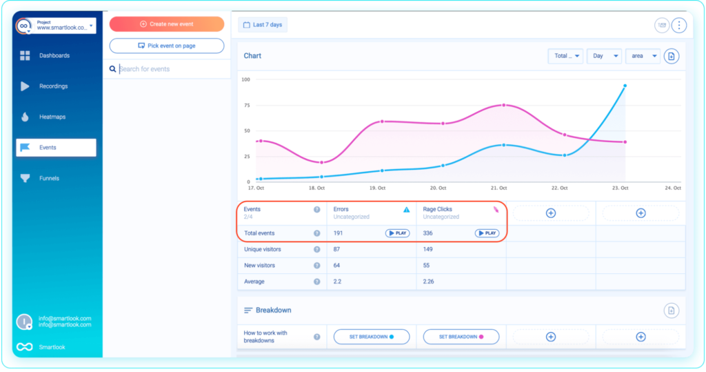
You can even compare the occurrence of different events on the same screen. For example, the screenshot below shows a comparison of two button click events — one for clicking on “Buy package” and the other for clicking on “Pay now.”

You can also create anomaly alerts to get notified in case of a sharp increase or drop-off in the occurrence of an event.
For example, say you have a “Request demo” button on your site, which visitors click to contact your team. If the button stops working due to a bug, you want to know right away, as that may cause you to lose potential customers. Anomaly alerts can detect if button clicks drop significantly, so you can fix the problem before it affects your bottom line.
#3 Analyze the user journey through key flows with funnels
Funnels are sequences of steps users take to complete a goal, like:
- Buying a product.
- Signing up for a newsletter
- Completing an onboarding tutorial.
Funnel analysis can help you find friction points by showing which steps lead to the most drop-offs.
With Smartlook, you can build funnels by placing two or more events in the order you believe your users follow. For example, the screenshot below shows a funnel that tracks tutorial completions.
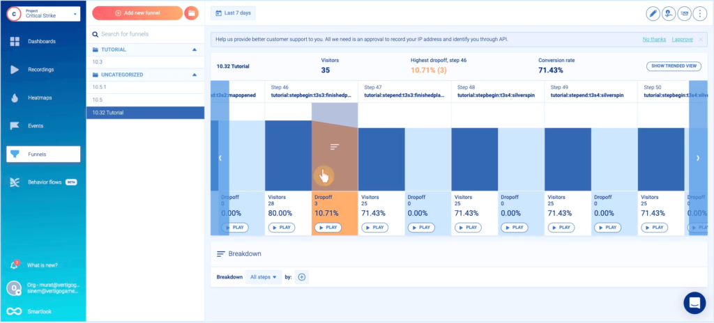
As you can see, Smartlook automatically shows key information about this user flow, like:
- The funnel’s overall conversion rate (71.43%.)
- The drop-offs between each step.
- The step that led to the most drop-offs, which indicates a point of friction (Step 46).
Additionally, you can break down each step of the funnel by country, device, browser, or other criteria.

This can help you find valuable insights about different user segments, e.g., that Mozilla users are converting at a much lower rate, indicating a browser compatibility problem.
#4 Combine events and funnels with session recordings to understand why users do what they do
Events and funnels are great at telling you what your visitors do, but not why they do it. Without understanding the “why” behind users’ actions, it’s often hard to uncover what’s stopping them from converting.
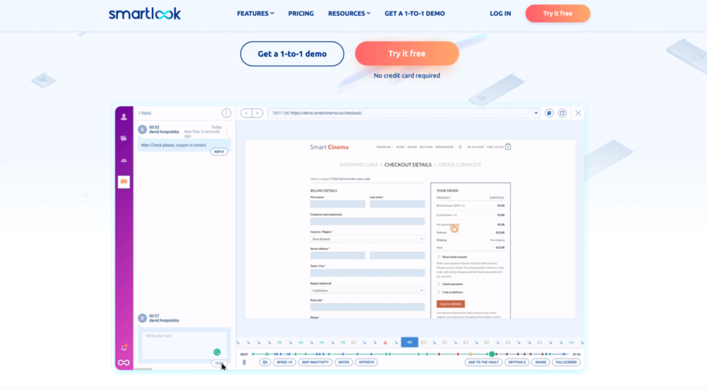
That’s why Smartlook lets you combine events and funnels with session recordings. Session recordings (sometimes called session replay) show you users’ entire experience with your site or app, from the moment they open it to the moment they close it.
For example, the screenshot below shows a user completing an onboarding tutorial.
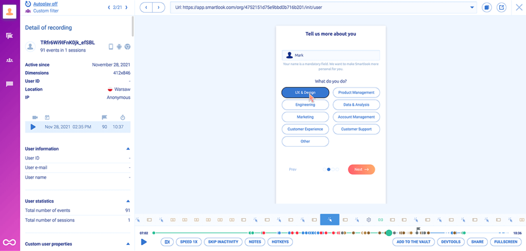
Here’s how combining events and funnels with session replays can surface useful insights:
- Combining events with session recordings shows you the full context behind users’ actions. For example, you can watch all session replays where users added a product to their cart. This lets you see what users did before and after performing the event and compare them to others who didn’t make a purchase.
- Combining funnels with session recordings shows you why users drop off. As you can see in the screenshot below, each drop-off step has a “Play” button under it. Clicking it takes you directly to all session recordings of users who dropped off at that stage. Watching these sessions can often show you exactly what’s preventing users from converting.
#5 Reduce drop-offs in your checkout flow
E-commerce stores, SaaS apps, or other businesses that sell online often lose potential customers during the checkout phase.
With Smartlook, you can build funnels that map your checkout flow to quickly see where users drop off. Then, you can jump into the relevant recordings to understand why and fix the problem.
For example, take a look at the 3-step checkout flow below:
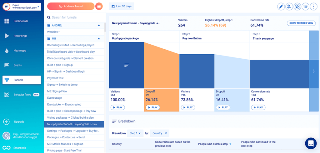
There’s a 16.41% drop-off between Step 2 — people clicking on “Pay now” — and Step 3 — people landing on the “Thank you” page. In theory, these drop-offs shouldn’t exist, because people who picked an item and clicked “Pay now” clearly want to buy.
In practice, all sorts of issues can lead to drop-offs, which is why session recordings are so essential. As we already said, Smartlook lets you watch the screen recordings of those 32 visitors who dropped off between Steps 2 and 3. As a result, you can watch their exact experience and see what’s causing the drop-off.
#6 Fix bugs, crashes, and elements that confuse or frustrate users
Bugs and crashes often lead users to leave your site or app without converting.
Additionally, sometimes users get confused or frustrated by elements, which also results in drop-offs. These can be harder to pin down than bugs but have just as much of an impact from a CRO perspective.
Here are two ways Smartlook can help you:
- Automatic tracking of JavaScript errors and rage clicks as events. This functionality lets you quickly find session recordings of users experiencing an error or getting frustrated. With JavaScript errors, you can send the relevant session replays to your developers, which makes debugging easier. With rage clicks, you can watch the recordings and try to see where the confusion is coming from (e.g., maybe users are clicking on elements that aren’t clickable).
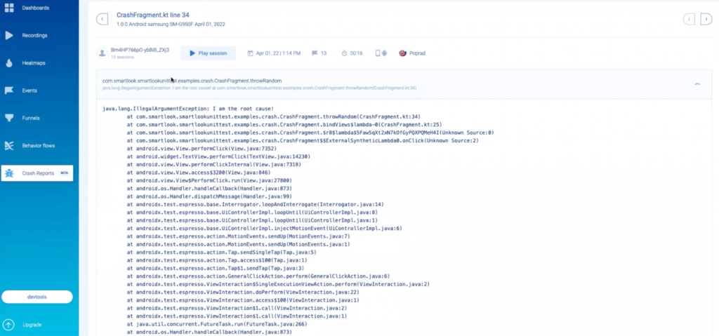
- Crash reports (for Android apps). Smartlook can automatically detect app crashes and give you a stack trace and relevant session replays leading up to the crash. This speeds up debugging and lets developers fix issues they otherwise couldn’t have.
#7 Optimize your forms
First and foremost, follow the golden rule of form optimization:
Ask users to fill out as few fields as possible.
The more fields you have, the more work users have to do (i.e., friction), and the larger the chance they won’t complete the form. If you won’t use their phone number or surname, don’t ask for them.
Additionally, explain why you need their information and link to privacy policies, security certifications, and other relevant documentation.
Smartlook can also help you analyze how users interact with your forms with our standard “Typed text” event.

With this event, you can monitor the action of users typing text into each form field, build a funnel that tracks the form completion process, and analyze which fields cause the most drop-offs.
Additionally, you can create custom JavaScript events to track when users:
- Click on each form field.
- Receive an error message.
- Spend a certain amount of time on a form field and more.
#8 Ask users for feedback
In some cases, the easiest way to find user experience problems is to talk to your visitors. For example, you can ask users to rate their experience on a scale of 1 to 5, then ask those who gave a low score to quickly explain their problem.
Consider using a tool like Survicate to create pop-up surveys on your site or app and get feedback in real-time.
You can integrate Survicate with Smartlook and watch all session replays where users completed your survey or filter the ones where they selected a specific answer.
For instance, if a user gives a negative answer (e.g., 1 out of 5) to a question like “How well is this page working for you?”, you can watch their session recordings to see what went wrong.
#9 Speed up your website or app
As Shopify has noted, site speed can have a big impact on conversions, loyalty, and organic rankings. You need a fast website or app in order to secure as many conversions as possible.
This is a complex technical topic, so you’ll likely need a developer. Here are two beginner-friendly resources to get started:
- Google’s PageSpeed Insights identifies performance issues on your site.
- HubSpot’s guide on website performance provides a detailed overview for beginners.
#10 Make your website mobile-friendly
Mobile viewports are vastly different from desktop ones, which can cause all kinds of UX problems. For example, issues like headlines getting cut off or images turning blurry on a smaller viewport can ruin the experience for visitors on mobile devices.
Google has lots of tips on mobile-friendliness, like:
- Use the Mobile Friendly Test tool to see if your site is mobile-friendly.
- Measure the effectiveness of your website by how easily mobile customers complete tasks.
- When building your site, select a template, theme, or design that’s consistent for all devices.
For a technical deep-dive, check out Google’s guide on choosing a mobile configuration.
#11 Simplify your layouts by removing distractions
Lots of users come to your site with a goal — to research your product, get a demo, see your pricing, etc. Anything that distracts from that goal can potentially drive them away.
Here are some ideas to try out:
- Remove stock images and videos.
- Consider removing the navigation bar in certain situations.
- Use heatmaps to see which areas most users don’t pay attention to. These might be good candidates for a rework or removal.
- Use events to see which elements users don’t interact with. Again, this can give you ideas for which buttons, links, or text fields to remove or rework.
#12 Offer free shipping
Studies going back to 2006 show the immense power of free shipping. Not much has changed today, as free shipping remains a massive driver of business.
In fact, one of our customers increased product conversions by 161% in two months by reducing shipping costs.
If you offer free shipping, make sure to say that prominently on your homepage, product pages, checkout page, and in your ads.
How to boost conversions by increasing users’ motivation to buy
Once you’ve removed any unnecessary friction from your site, you may want to look into ways to increase user motivation. Here are seven tips that can help you increase conversions by getting visitors more excited to buy.
#13 Write compelling and clear headlines, subheadlines, and CTAs
A big part of getting users to convert is enticing them with your value proposition. And since headlines, subheadlines, and CTAs are typically the most visible elements, they’re a great place to start.
Here are some ideas to try:
- Explain what your product does, who it’s for, and the value it provides above the fold (clearly, without using jargon.)
- Focus on your product’s benefits, not its features.
- Address common objections with expressions like “no credit card required” or “no prior experience needed.”
- Make your CTAs specific, with a focus on the value for the customer. For example, instead of saying “Sign-up,” say “Get started in 5 minutes for free.”
There’s a whole science to writing pages that convert, so for more details, check out Julian Shapiro’s handbook.
#14 Include high-quality, relevant images and videos
Relevant images and videos can make your pages more interesting and communicate your product’s benefits.
For example, our homepage has an embedded video right below the hero section.
The video shows visitors how to watch a session recording, track events, and find user behavior insights with Smartlook, which are all things potential customers care about.
Lastly, make sure the multimedia elements you include are relevant. If they aren’t, they become unnecessary clutter and just distract users from converting. Showing your product in action is usually the safest bet in that regard.
#15 Match your visitors’ expectations
When optimizing landing pages, consider how visitors arrive on them — from a search engine, paid ad, social media, platforms like Amazon, etc. — and match their intent.
For example, we’re running a search ad for the query “Smartlook vs FullStory”.

In this context, users don’t want to learn about our product in general. They want to see how it compares to another product. That’s why the ad doesn’t lead to our homepage, but to a comparison page.

Put simply, giving visitors relevant content (instead of a generic homepage) helps reduce bounce rate and increases the chances of them converting.
#16 Use different types of social proof
Social proof helps back up your claims and build trust with your target audience.
Some social proof elements you’ll notice on our site:
- Customer logos.
- Ratings on sites like G2, Capterra, and TrustRadius.
- The number of users subscribed to our product or service.

- Customer quotes and testimonials.
- Case studies, which are great for increasing motivation, since prospects can see that we’ve already solved a problem they might have.

#17 Send abandoned cart emails
Abandoned cart emails are sent to visitors who added products to their cart, but didn’t complete their purchase. They’re a popular way to “save” sales that otherwise would be lost. In fact, research by Klavyio showed that businesses using these emails earn back up to 14% of lost sales.
All popular email marketing tools have abandoned cart templates, so it’s easy to get started. The emails can even include extra incentives for users, like free shipping or a limited-time discount.
For inspiration, check out HubSpot’s article on the best abandoned cart emails.
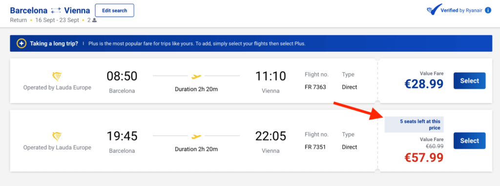
#18 Utilize quantity- and time-related scarcity
Scarcity is a powerful way to induce action. For example, you’ve probably seen airline companies using banners like the one below to get more people buying quickly.
The same principle can be applied to any online transaction, so:
- If you have items in limited quantities, mention that in a way that catches users’ attention (e.g., contrasting color, prominent placement, larger font).
- If you’re running a promo, add a countdown timer letting people know when your offer expires.
Quick note: Scarcity must be authentic to work. Don’t expect conversions to increase if your limitations are made up.
#19 Offer a free trial and money-back guarantee
These last two tips help alleviate users’ anxiety about spending money on a product or service.
Free trials let users try your product before buying it.
Money-back guarantees show users that they’ll get their money back if the product isn’t up to par. They’re typically limited to a 10- or 20-day timeframe, but some companies have lifetime guarantees.
Here’s what we do for Smartlook:
- We have a free forever plan, which you can try without providing a credit card.
- All our paid plans start with a 30-day, full-featured trial.

- We offer a 15-day money-back guarantee.
- We have a free public demo, where you can test the product (no need for registration, credit card, or even an email)
The massive importance of A/B testing for increasing conversions
Some of the tips in this guide, like fixing bugs and speeding up your site, don’t require any hypothesizing or testing. But in many cases, it’s impossible to know whether implementing a change will actually result in more conversions.
For example:
- Changing a heading with a new, presumably better one, might lead to confusion for visitors.
- A seemingly unnecessary layout element (e.g., a FAQ section) might be important to a specific user segment.
- Adding more social proof might backfire by making a page more distracting.
That’s why it’s essential to A/B test most changes before implementing them.
A/B testing is a method of comparing two versions of a page or app against each other to see which one brings in more conversions. For example, you can create a page with a new headline or layout and test it against the current one, before making a decision. That way, you can make changes confidently, instead of implementing general tips and hoping for the best.
For more details, check out our detailed article on the top 10 A/B testing tools.
Quick note: Smartlook integrates with Google Optimize, Firebase A/B testing, and Optimizely — three of the most popular A/B testing platforms — so you can see how users interact with each variant you’re testing. This is crucial for verifying the accuracy of your experiments.
Use Smartlook to find and fix the problems that prevent users from converting
Smartlook’s unique combination of quantitative data (events and funnels) and qualitative analytics (session recordings) helps you find and fix the user experience problems that prevent visitors from converting.
Sign up for a full-featured, 30-day trial of Smartlook today (no credit card required), or schedule a demo with our team to get an in-depth presentation that’s tailored to your business.


