In this article, we explain why it is important to make product page optimization a priority and the 13 things you should take into account.
Your product pages are usually the first meeting point for a customer and a product. At this stage, it is your chance to build user confidence and facilitate the purchasing decision. As an effect, you will improve your conversion rate and grow sales.
What makes a great eCommerce product page?
All product pages should be simple and user-friendly. The main goal for them is to give your ideal client the right information to help them buy the product they want or show how your product can work out for them.
As Sam Meenasian, Marketing Expert at USA Business Insurance puts it,
“The primary goal for your product pages is to build user confidence by giving all the information necessary for a purchasing decision, making the process intuitive and avoiding confusing users.”
There are four main components you should know for creating a great eCommerce product page:
- Your product
- Your brand
- Your copywriting
- Your page design and user experience.
Keeping this in mind, here is how you can optimize your product page and support the success of your eCommerce store:
Conduct keyword research
Make it easy for users to discover your products in the crowd of competitive offers. Conduct detailed keyword research to determine the phrases your product pages should rank for in the search results. Try to use product-focused topics that customers are looking for. Think about relevant and what will actually drive more conversions.
Make sure that product pages have transactional intent. Your landing pages should be optimized for searchers that are ready to buy the right way on your site.
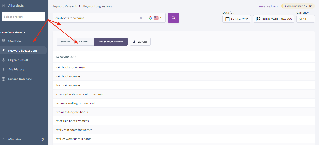
If you run a small shoe brand, it will be hard to outrank your globally-known competitors for the short keywords such as “boots” or “wellies.” Instead, try to find less competitive long-tail keywords such as “rain boots for women.”
Keyword suggestion tools like SE Ranking can help you find out core keyword parameters like difficulty score, search volume, and CPC, identify product page keywords to target, and analyze your competitors’ keywords in both organic and paid search.
Optimize titles and meta descriptions
Once you have identified your product page keywords, it is time to locate them strategically on the product page. Adding them to title tags and meta descriptions is a must-have for your product page optimization.
Your page title and meta descriptions should be unique, not too lengthy, and have a target keyword. You can insert the keyword at the front of the title together with your brand name for reaching maximum effect. To draw more clicks, you can add symbols and numbers to your descriptions.
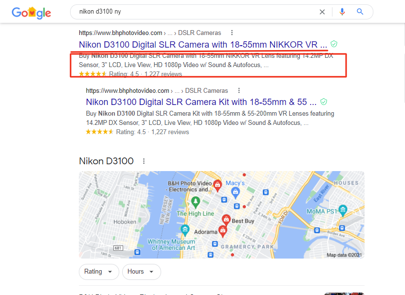
Make sure that these sections are truly informative and compelling not only to Google robots but also to humans. Try to include more selling points in the description of your product (brand, price, name, model, key features and specifications, and other important information). Since titles and meta descriptions are important for accessibility, keyword stuffing is both unwelcome and ineffective.
Use high-quality product pictures
People buy and consume with their eyes; that is why high-quality product photos are essential in eCommerce. Your product pictures should be well-lit, clear, and faithful to reality. You can also use a white background for your product photos to highlight your product and keep consistency.
Make sure that good quality will not ensure sales if the quantity of the pictures is insufficient. According to the source, 34% of consumers want different photos of a product before making a purchase? Because they can’t touch, see, feel, or try the product.
So, depending on the specifics of the products you sell, provide multiple images showcasing the items from different perspectives and close-ups on details. You can prepare a 360º vision of your product to emphasize its main features.
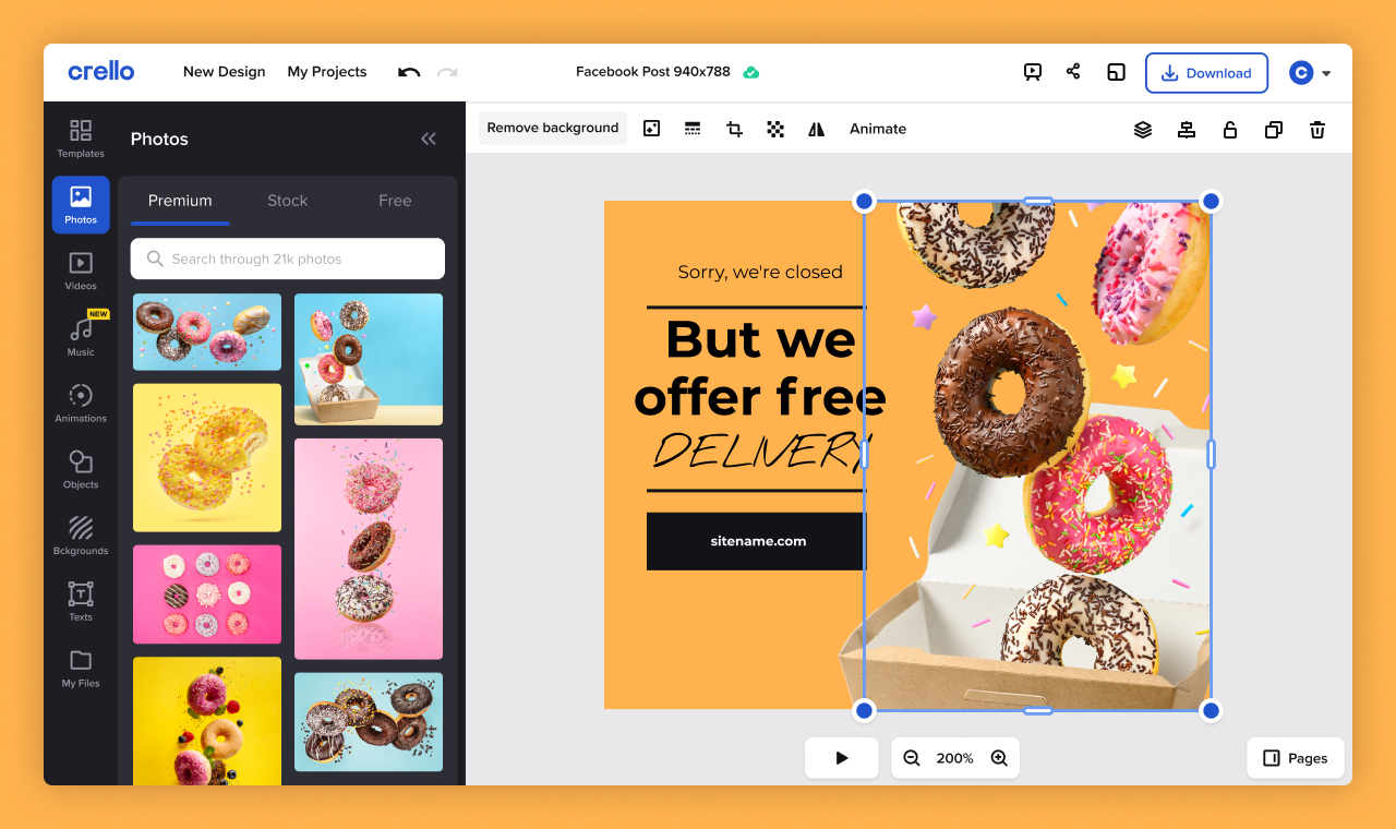
To create engaging product visuals, you can use the graphic design tool like VistaCreate to encourage more customers to buy your products.
Provide detailed product information
Users should be able to find high-level information such as the size or price of your product at first glance just by scanning the page. That is why it is crucial to provide all these details in a clear way. You can bold the font to highlight the most important pieces of information.
To illustrate details such as dimensions of your products, use illustrations or tables rather than lengthy descriptions. It will be easier for users to find the answers to their questions quickly.
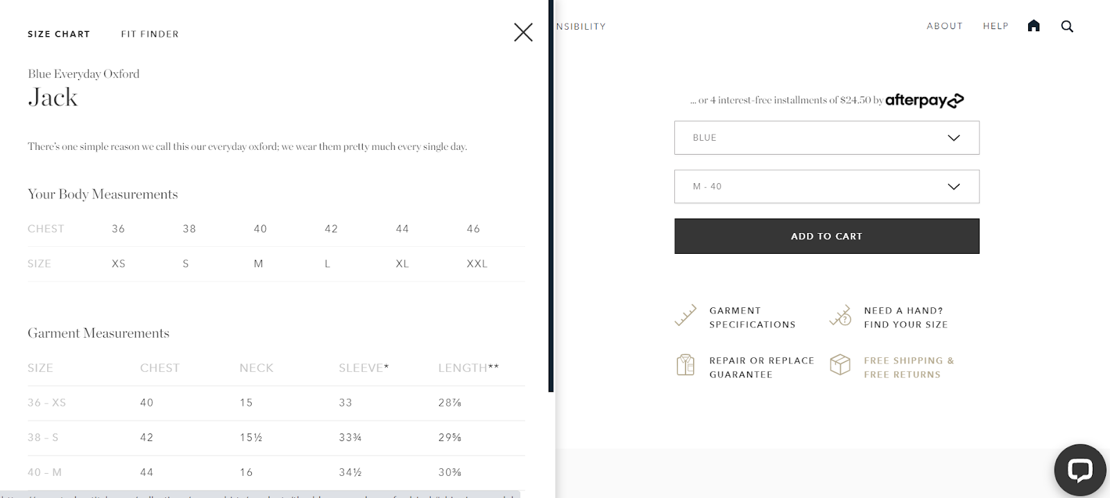
Try to add a polite and personal touch to your product information. Explain to them why they should choose and buy your products, and what makes you the best over others.
Decide on a clear call-to-action (CTA)
A well-chosen CTA button can quickly turn visitors into customers. Most eCommerce sellers choose a simple “Buy now,” but you can test out different options and choose a CTA that, in your case, brings the best results. Some other ideas for your CTA button are “Shop now,” “I want it,” or “Checkout.”
Experiment with the size and color of your CTA button, and make sure that it stands out from the background. You can use simple animations like pulsing or gentle flickering to grab the attention of the page visitors.
For example, we’ve conducted an A/B test for our client to figure out the best CTA text for audiences who are looking for personal injury lawyers. Here’s how it looks like now:

Add customer reviews and ratings
With all the fancy technologies available and loads of smart tricks up your sleeve, word of mouth still proves to be one of the most efficient marketing tactics. You know that 85% of customers still trust online reviews as much as personal recommendations.
People always check out what other customers think about a product they want to buy. By adding reviews and ratings of your products, you will gain trust in the eyes of shoppers.
You can either incorporate the reviews of your loyal customers into the structure of your page or enable comments and rating sections on each product page. You can also include customer photos when they share with you to enhance trust and conversions.
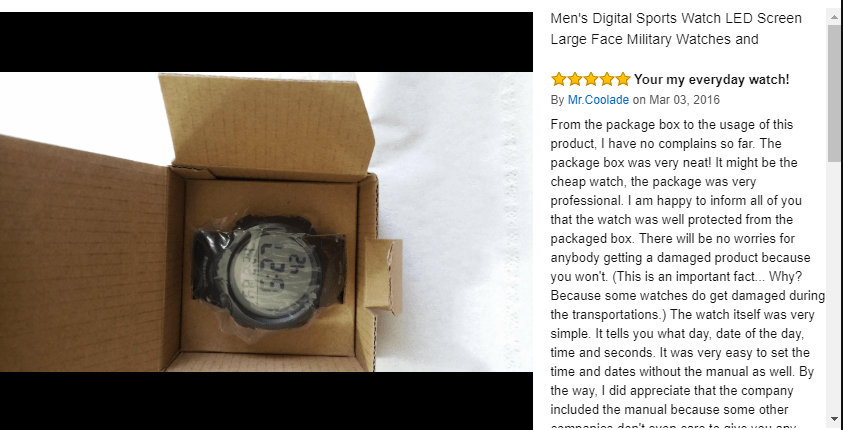
Positive reviews are always great. But make sure to instantly react to negative ones. Try to reach out to them to fix their problem with your product. Be polite, ask questions, listen to them, and offer the solution to soften the disappointment
Use structured data for product pages
Structured data makes it easy for search engines to examine your product pages’ images and content and display that content accurately as rich snippets. As a consequence, your product pages can drive more impressions, clicks, and sales from the search results. Make sure that you use structured data to highlight star ratings, prices, or reviews.
Stick to the standard product page structure
There is not much space for creativity on your product pages. In order to provide a seamless buying experience, make sure that your pages include all the standard elements.
Users should always be able to spot your logo at the very first glance and easily navigate to the other pages on your website. Including product thumbnails allows shoppers to make sure that they are on the right page before it fully loads. Apart from these, always include such elements like the product title, its full description, breadcrumbs, the CTA button, the shipping options, additional information, reviews, and certificates.
Reduce the loading time
A fast loading time hugely influences user experience and conversions. In fact, 37% of visitors bounce when a page takes five seconds to load. Page speed is also one of the factors that influence Google rankings.
For these reasons, you should make your product pages as light as possible. Use PageSpeed Insights to analyze the loading time of your pages. The tool also provides hints on how to reduce the load time.
Optimize your product URLs
Keyword-friendly and well-structured URLs are of paramount importance in SEO. Your product page URLs should be short, written in lower-case, and use subfolders.
If you need to redirect old URLs to the new ones, use the 301 permanent redirect – it passes full ranking power to the redirected page. Avoid any dynamic elements and remove all unnecessary things in the URL structure.
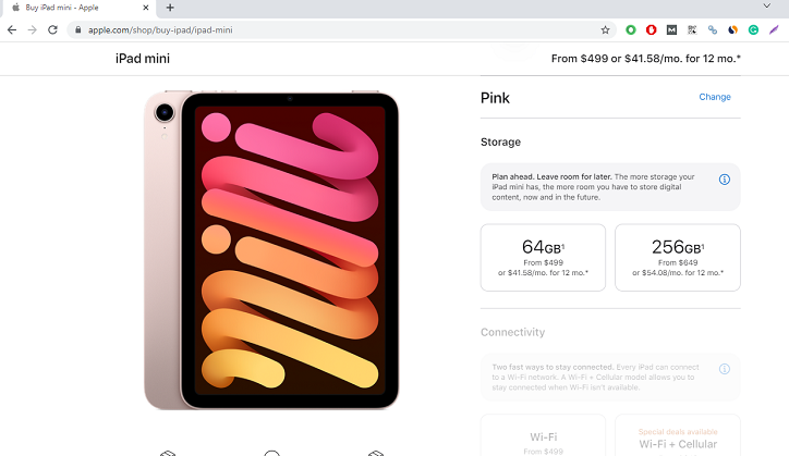
Include pricing and shipping costs
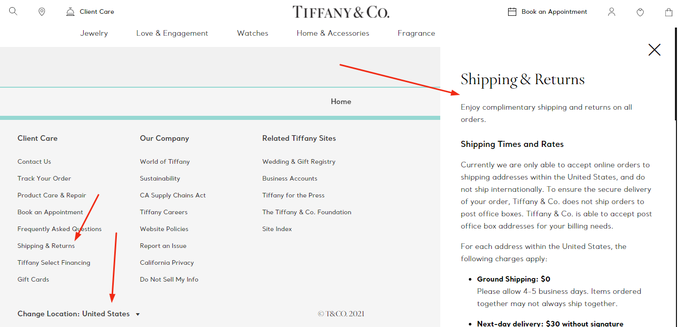
Make it clear for users what the total price of the purchase is. Dedicate one tab to describing the shipping options and list the countries that you send your products to. Be transparent with your customers about your charges. Include all different shipping methods. If you offer free shipping, make sure to include this information in a visible place on your product page.
If your products are relatively expensive, justify the prices in the copy: highlight the information about the materials, place of origin, the time and effort invested in the production. Do your best to communicate the value and quality behind your offerings.
Optimize your product pages for mobile
Today mobile eCommerce makes up almost ¾ of the global eCommerce sales. It means that you must optimize your product pages for mobile devices. Firstly, focus on your page speed. People shop using their mobiles to save time, and if your page doesn’t load quickly, it will defeat the purpose of using mobile devices.
Secondly, make sure that shoppers can effortlessly find any piece of information and complete the purchase on mobile from anywhere, anytime. Finally, optimize the checkout process. Check out whether users can easily enter their personal and payment info to complete their purchase on mobile.
If you have some budget, you can develop your own shopping app to create a better user experience and increase your eCommerce product page conversions.
Create a great navigation experience
Product pages with well-thought navigation allow users to complete their searches quickly and intuitively. To provide a seamless navigation experience, divide your products into main- and subcategories – it will make it easier to organize your menu section.
Use breadcrumbs on your website to help shoppers quickly browse and find products. Breadcrumbs also help search engines to easily crawl your web pages.
Make sure to create a big search box. The product categories should not be too narrow as it would make it harder for users to find the product they are looking for. The priority is to allow them to get to the product page they are looking for in the quickest possible way.
Add a FAQ section
Having run your eCommerce store for some time, you can definitely list some questions regarding your products that people ask regularly. But have you ever imagined how many times someone bounced off your site just because they didn’t want to talk to your chatbot or send you an email to dispel their doubts?
A clear FAQ section can help you keep these customers on your product page and convert them into potential customers. What is more, including a FAQ section on your site can also help your search rankings. Make sure to mark up this section with FAQ structured data. Here is a good example from Catania & Catania to ask and answer all the questions on the homepage:
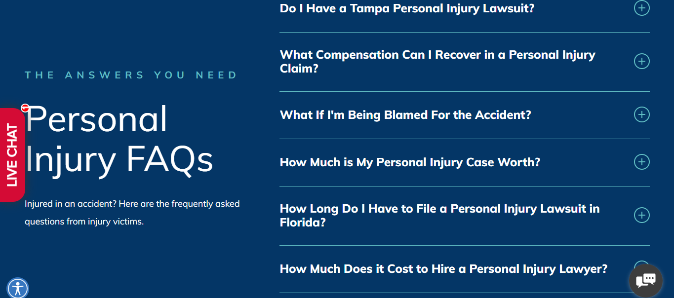
Source: Catania & Catania
Outline your return policy
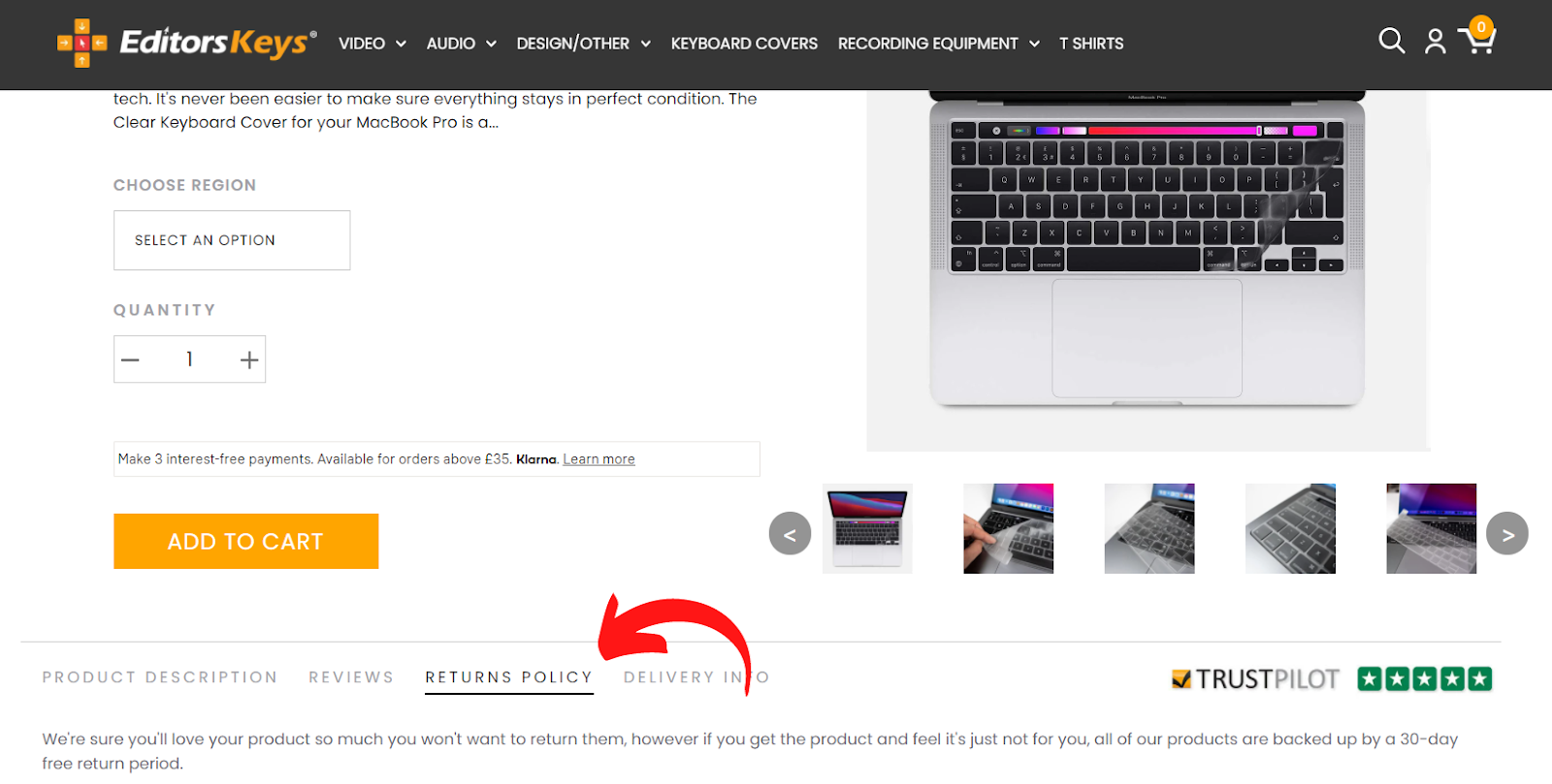
Since shoppers can’t touch, see, or try on the products from your online store, the returns can happen quite frequently. A clear return policy is a must on your site. Customers should know that they can always return the product anytime and they can trust your store. Make sure to include your return policy either in a separate tab on every product page or within the footnote.
Measure your success
Once all the optimization is done, it is time to measure the success of your eCommerce product pages. With web analytics tools like Finteza, you can analyze sales funnels, conversions, and traffic quality.
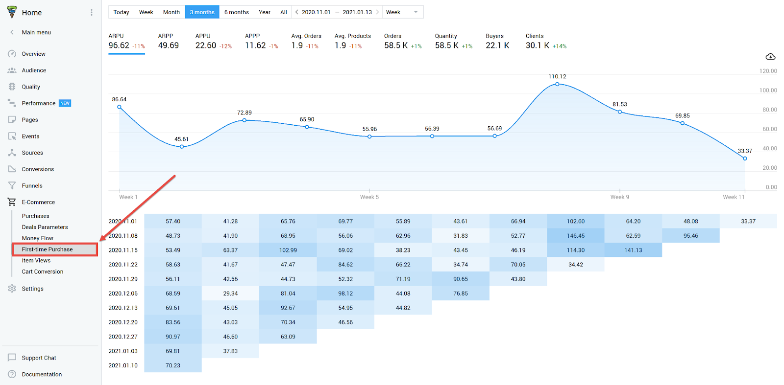
You can track all the actions performed by shoppers before they make a purchase, and visualize the tracked events in the form of histograms. Generate and analyze the grams regularly to identify potential obstacles and make sure that you provide users with the most convenient buying experience possible.
Conclusion
Even without coding skills or UX and SEO knowledge, there are plenty of fields that you can easily optimize on your product pages. You should focus on the tips mentioned above to create a better shopping experience for your consumers.
I know it can take much time and marketing effort, but it will help you increase conversions and make your customers shop again.


