Mobile onboarding is your first chance to make a good impression and show off to your customers. The more frictionless the onboarding process, the more users are likely to use your app. A good onboarding experience triggers positive reviews, more downloads, and higher engagement.
After reading the following article, you’ll understand all the aspects of mobile customer onboarding strategy.
What’s in it for you?
What is mobile user onboarding?
11 practical ways to improve your mobile user onboarding process
- Set a straightforward onboarding goal
- Design an onboarding flow
- Include a “skip” button and make sure it’s visible
- Optimize the number of onboarding steps, and track anomalies
- Segment users and implement contextual onboarding
- Highlight key features and underline user benefits and values
- Onboard mobile users like online games do (they do it best)
- Use gamification and the endowed progress effect to your advantage
- Ask for as little as possible — be minimalistic with your mobile onboarding screens
- Automate onboarding welcome emails
- Collect user data and analyze your mobile onboarding outcomes
Never stop optimizing your mobile customer onboarding process
What is mobile user onboarding (mobile app onboarding)?
Mobile user onboarding is the second step in a mobile user’s journey.
Mobile app installation
Mobile app onboarding
Mobile app adoption (retention)
Plan renewal (commitment)
It’s the process of introducing new users to your app. During onboarding, you guide new users through your product, provide them with relevant information, and help them set up their accounts.
It’s also the first time a user starts to understand the value of your product. After the mobile customer onboarding process is complete, users should be familiar with:
- Your mobile user interface (UI)
- Gestures and navigation patterns
- Basic functionality of the app
For example, say you have a healthcare medical app. First, users create an account in a few taps (or log in if they already have an account). It should be easy for them to confirm their medical ID, find a specialist, and book a visit. Afterward, the path to access a doctor’s recommendations and fill out a prescription request should be short.
Why a good customer onboarding experience is so essential
Good mobile onboarding is vital as it:
- Helps users reach the “AHA” moment and understand an app’s value
- Ensures users are familiar with core features of your app and their benefits
- Motivates users to pay for the app at the end of the free trial
- Helps improve in-app conversions
- Helps increase user retention
Let’s focus on user retention — the number of unique users that visit your app over a specific period. The average retention curve looks like this:
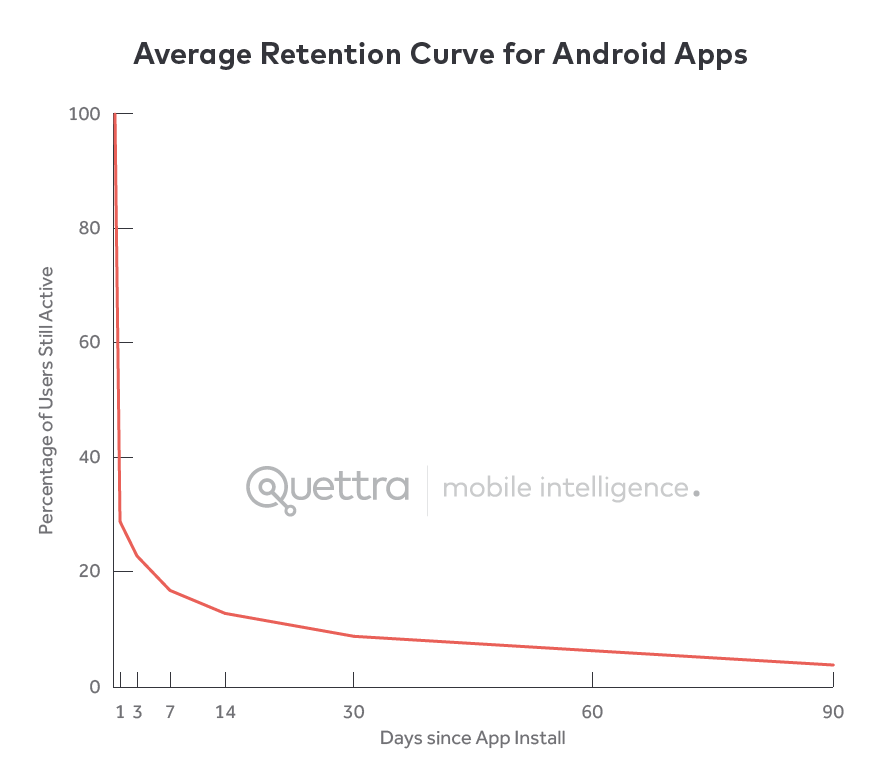
Andrew Chen says that the average app loses 77% of its daily active users (DAUs) in the first 3 days after installation. Within 30 days, that number increases to 90%.
There are many reasons why users drop mobile apps, including a bad user experience (UX), crashes, low app value etc. But low retention rates are also due to poor mobile onboarding.
If you want to bend the curve and retain more users in the first days of installation, keep reading to discover 11 practical ways to onboard mobile users properly.
Note: In this article, you’ll learn how Smartlook can help you improve your onboarding process. If you don’t have an account, set one up here for free.
11 practical ways to make your mobile app onboarding process stand out
1. Set a straightforward onboarding goal
A clear goal makes it easier to measure the success of your in-app user onboarding process. Be sure to keep things simple and realistic. For example, “I want 70% of my users to complete the onboarding process.”
To keep track of your goal, create a list of mobile events. Think screens visited, and elements tapped.
To ensure your goal remains on track, compare two or more events, such as:
- “Reached_first_step_onboarding”
- “Reached_second_step_onboarding”
- “Finished_onboarding”
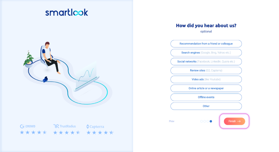
For example, you can track the orange Finish button to determine how many users tapped it.
Take a look at the following short video to see how easy it is to create an event.
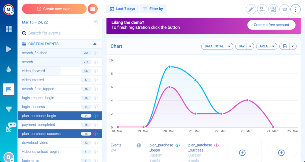
Another example of goal setting is to compare the number of users that reached your app’s paywall vs. the number of users that went all the way and paid. Create “Purchase_plan_begin” and “Purchase_plan_success” events to view the numbers.
Compare these 2 events by pressing Ctrl/Command and selecting the events from the action sidebar. Your comparison will look like the following graph:
You can also play with events in the open demo environment.
2. Design an onboarding flow
After setting a goal, it’s time to consider your onboarding flow and the type of mobile onboarding method you would like to use.
The onboarding flow should:
- Be frictionless, so users don’t have to put much thought into it
- Consist of easy-to-accomplish tasks before moving on to the “harder” parts of the onboarding process
- Afford users the option to skip binding offers (unless necessary)
- Take into account the user’s intent (ask about their goals at the beginning, then personalize the rest of the onboarding process based around them).
Let’s take a closer look at various onboarding methods. Feel free to mix and match — you’re not limited to one technique.
- Contextual onboarding (aka instructional or progressive). A progressive onboarding guides users through your app, explaining how to use it. This can come in the form of a deck-of-cards tutorial, contextual help, or an interactive walkthrough.
PRO TIP: In our opinion, contextual onboarding is a great way to familiarize users with your app. Relevant instructions combined with a hands-on approach will strengthen a user’s memory. Learn more about this approach in section 5.
- Benefit-based onboarding. Prioritizes benefits and added value over teaching users how to navigate your app.
PRO TIP: Choose this method if your app is easy to use. Don’t focus on this type of onboarding if you have a complex UI or uncommon in-app gestures and patterns. Learn more about this approach in section 6.
- Feature-based onboarding. Users learn how each feature works so they can accomplish their goals.
PRO TIP: This onboarding model works great with a benefit-based process. Don’t stick to a feature-based onboarding approach if your app is for tech-savvy users. Showcasing features without explaining the value may result in low user retention. Learn more about this approach in section 6.
Whatever onboarding method you choose, test it with your users and analyze the flow. The easiest way to track a user’s path is to perform a funnel analysis.
For example, Vertigo Games created a 60-step tutorial funnel to determine if their users completed the onboarding process.
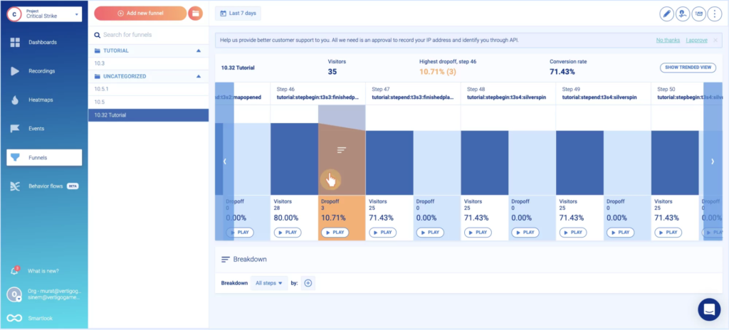
The most significant drop-off occurred on step 46 of 60. Vertigo watched the recordings with a push of the “play” button to verify what was responsible.
3. Include a “skip” button and make sure it’s visible
Frictionless onboarding involves skippable options. Not only should you include the “skip” button, but make sure it’s visible.
Barely visible return arrows and skip buttons in low-engaging sections trick users into doing something against their will. Be aware. Not everyone wants to have their hand held throughout the onboarding process.
There are various reasons users skip through the mobile app onboarding process, including:
- Lack of time
- Level of technical expertise
- Knowledge of app functionality
- Motivation to learn things themselves
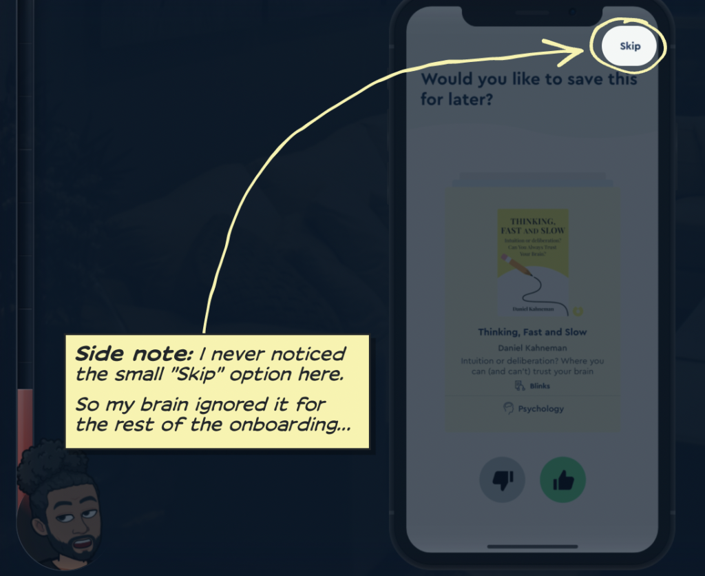
A practical example is Blinkist — a book-summarizing subscription service. Dan Benoni, Co-Founder of Growth.Design, analyzed the app’s onboarding model, stating that he never noticed the “skip” button even though he wished to skip the flow.
If you want to check the user engagement on each of your mobile onboarding screens, analyze mobile heatmaps. You’ll see what users engage with and what they skip. On mobile devices, heatmaps allow you to mark specific areas of interest to track user interaction.
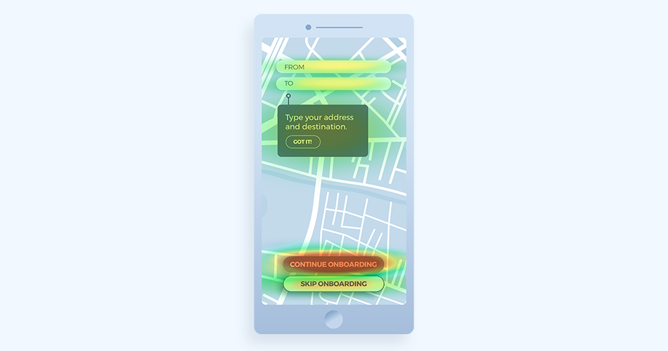
Have trouble reading mobile heatmaps? Hot (the most engaging) spots are red, whereas cold (the least engaging) spots are blue. There is also a range of colors between red and blue that depict average user engagement.
4. Optimize the number of onboarding steps, and track anomalies
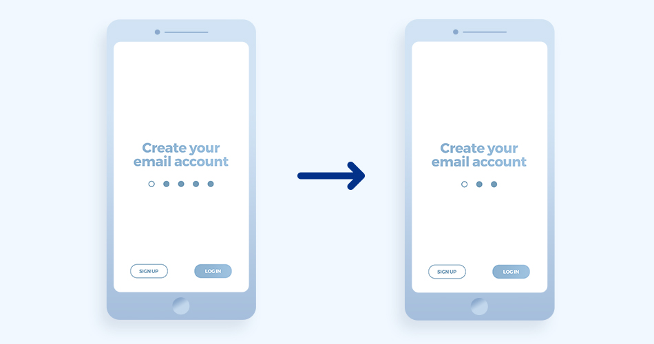
An expert onboarding process will quickly lead your user to the first “AHA” moment. If it doesn’t, consider shortening the number of steps to motivate users to complete the onboarding process. Keep users up-to-date regarding how long the process will take by numbering the steps involved.
To check how your onboarding flow is performing, use an event-based funnel. Learn how to create a funnel below:
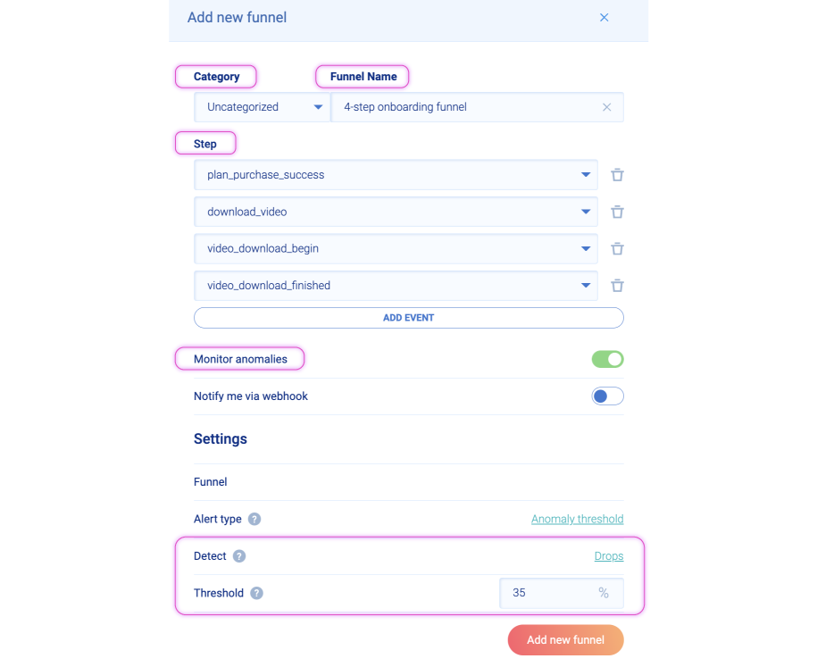
If you want to keep tabs on abnormal changes in your funnel, toggle “Monitor anomalies.” Set the alert type — what anomalies should be reported (surges or drops), and what percentage threshold should trigger the alert?
If there is a 35% drop in the funnel, you’ll receive an email. It may indicate that something is wrong with the funnel. Consider optimizing the funnel, making it easier for users to complete.
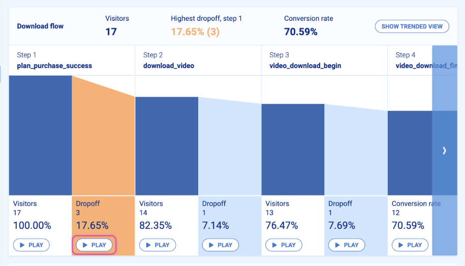
Analyze the most significant drop-off point and watch recordings by pressing the “play” button. It may be that step 1 is confusing, or your process contains a problematic task that users can’t complete.
By redesigning the flow and removing a step or two, you can increase the number of users that complete the onboarding funnel.
5. Segment users and implement contextual onboarding
Contextual onboarding lets you adjust paths to match a user’s goal. For example, if a user starts with a less popular feature, contextual onboarding allows them to discover it before jumping to key features.
This type of onboarding supports user segmentation and will enable you to exchange different messages with different user groups. Consider making the onboarding process more personalized after you’ve gathered data regarding your first user group.
You can segment users by the following:
- Patterns of behavior – group users by the intent they reveal at the beginning of the onboarding process. Take, for example, a meditation app where users choose among the following goals: relax, better sleep, and reduce anxiety. Based on their choice, create 3 separate paths to delight your users.
- User type or job title – if you have a business-related app, group users by profession. Later, you’ll be able to determine if there is any significant difference between the behavior of various user groups.
Funnels are the best way to analyze how user segments behave throughout the onboarding process. Consider breaking down your funnel by custom properties for a more detailed analysis.
For example, if you want to know how different segments of users behave when they face your paywall, create a 3-step funnel and go to the “Breakdown” section.

Press the “+” icon, and choose your custom property. In the case below, it’s user.type.
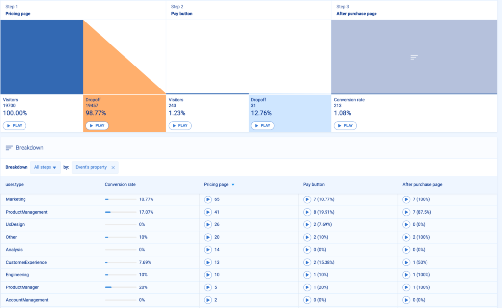
Thanks to this feature, you can see which user groups go through the paywall and which don’t. Be sure to provide a more benefit-oriented version to groups that convert less often.
6. Highlight key features and underline their user benefits and values
Jason Fried, the founder of Basecamp, shares a great thought about the difference between a feature and a benefit-oriented approach. Although the quote is from 2013, it’s still relevant:

As a product owner, growth marketer, or product manager, you’re probably focused on the technical side of your mobile app and the onboarding process. As such, you inevitably highlight your mobile app’s features.
Remember, your users have to see the benefit and final value of a feature. The more user-centric your approach, the more your users will appreciate it.
Ask yourself the following questions to uncover the final value of your mobile features:
- What makes your app relevant to your users?
- How does feature X allow users to achieve their goals?
- How quickly can they use feature X to complete a task and share results with their colleagues or boss?
But if you want to still focus on feature adoption, be sure to read about StoragePug and how they study recordings every time they release a new feature.
Thanks to recording filters, their product team can target and watch only the users that experimented with their latest feature. Based on these recordings, they can verify if their users are benefiting from the feature or if it requires tweaking.
7. Onboard mobile users like online games do (they do it best)
Even if you’ve never played an online game, you’ll understand the basics in no time at all. You’ll be performing basic moves, killing enemies, and learning how to access equipment out of the gate. Games heavily rely on providing additional instruction in context boxes, like the example below from “The Last of Us 2.”

By experiencing products as early as possible in the onboarding process, users don’t feel like they’re being onboarded at all. While they’re busy having fun, the app guides them through the process. It’s a great way to immerse users into a game gradually — let them learn by doing it themselves.
If you want to learn about mobile game analytics, read this article.
8. Use gamification and the endowed progress effect to your advantage
Gamification in mobile app onboarding
Staying on the topic of games, another way to use game-like onboarding methods is to implement gamification. Gamification uses elements from game design to make non-game applications more fun, competitive, and engaging.
If users collect points, unlock levels, or receive awards, they’re taking part in a gamified experience. Gamification helps users navigate the onboarding process with the satisfaction of accomplishing a goal.
For example, we wanted to make our sign-up process more fun, so we created a simple user checklist. Once you complete each step, it disappears which makes using Smartlook for the first time fun.
Another example of effective gamification is a car rental app for minutes. The last stage of the mobile onboarding process displays the stats of other users, including speed, braking, and driving technique. Users can then engage in friendly competition to see who is the best driver, stat-wise.
Endowed progress effect in mobile app onboarding
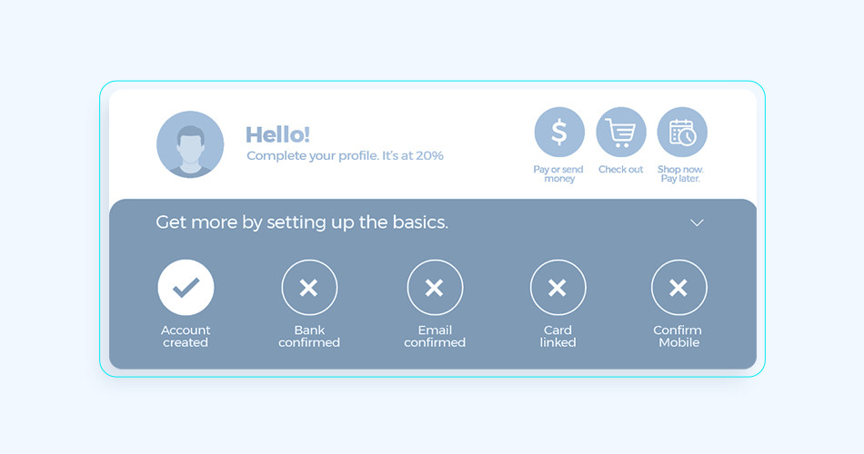
The endowment progress effect is a great way to motivate users to complete the onboarding process. This effect involves using artificial advancement to pull users through the flow.
9. Ask for as little as possible — be minimalistic with your mobile app onboarding screens
According to Hick’s law, the more options there are to choose from, the harder it is for a user to make a decision.
When users feel overwhelmed with options and information, they are more likely to:
- Struggle with decision making
- Lose sight of the main goal
- Churn
When it comes to the customer onboarding process, minimalism pays off. Design each screen with care, and remember that users differ in levels of determination when it comes to completing the flow.
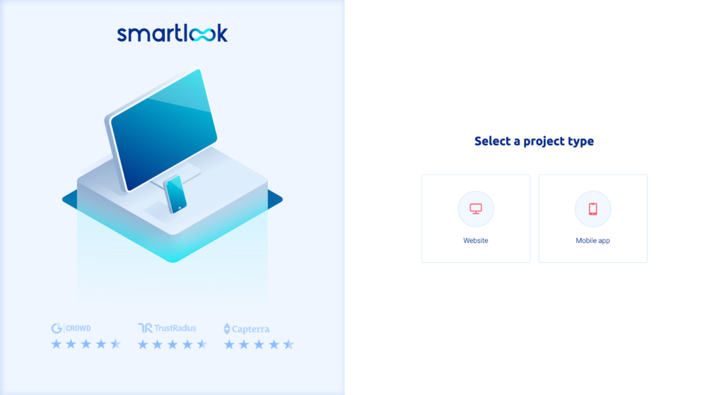
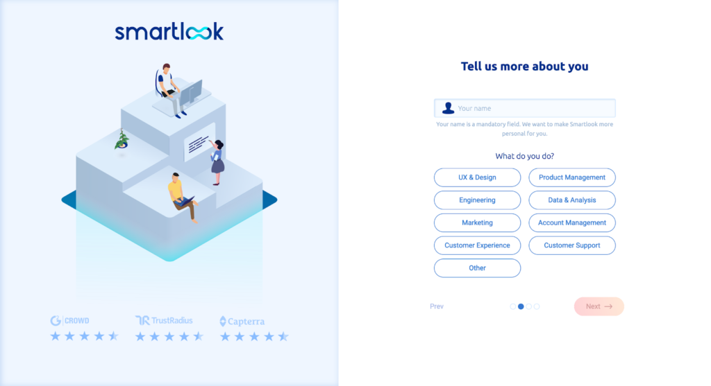
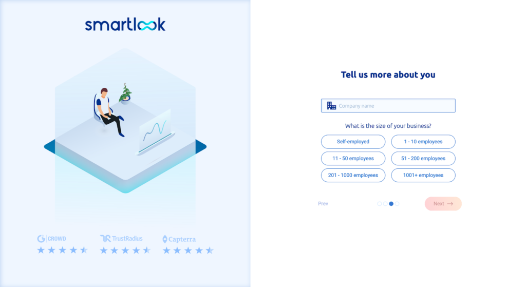
Take a look how Smartlook designed the onboarding process.
Step 1: Select a project type.
Step 2: Type your name and choose your profession.
Step 3: Type your company name and confirm the size of your organization.
Step 4: Tell us how you heard about Smartlook.
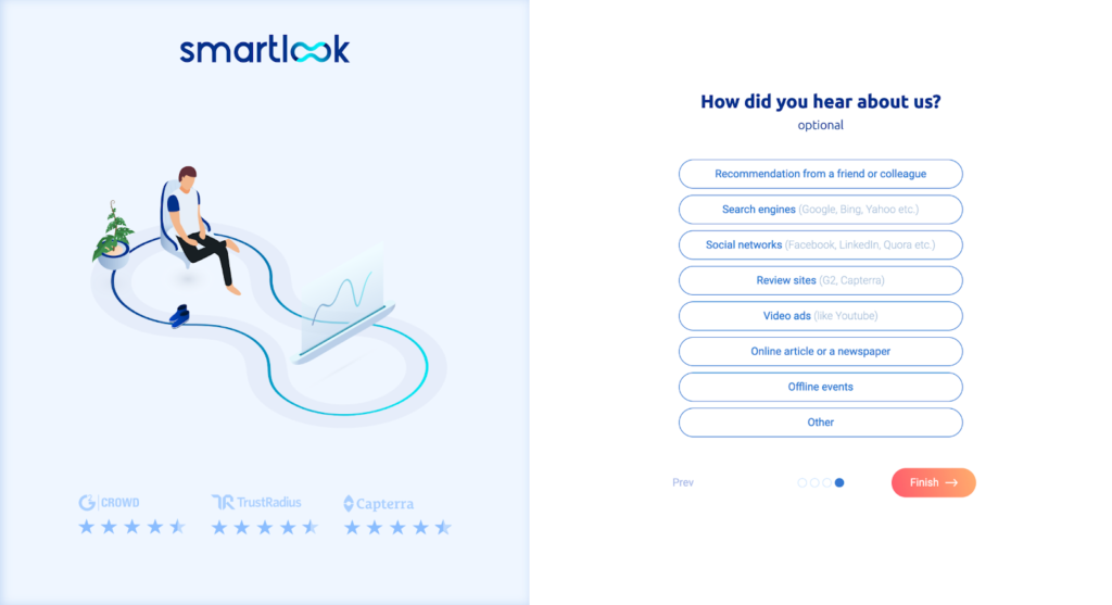
After pressing “Finish,” you can invite teammates and access your account. All that’s left is implementing a tracking snippet to your website or product, or installing SDKs if you want to track mobile.
10. Automate onboarding welcome emails
Don’t forget to automate the email flow of your mobile onboarding process. With an automated email flow, your users will get the correct information at the right time.
When it comes to timing, we mean spot-on. For example, a typical mobile Dropbox onboarding mistake we see often involves “verify email” prompts while the user is still navigating the onboarding process.
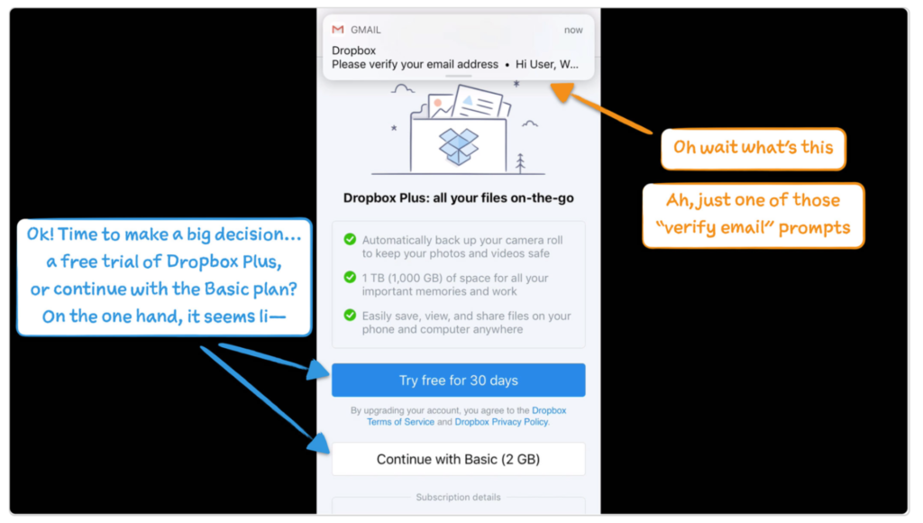
Instead of distracting users during the onboarding process, trigger automated emails to dispatch when the onboarding process is complete. Don’t interrupt first-time users. Remember, not all users have the same motivation when it comes to completing the onboarding process.
11. Collect user data and analyze your mobile onboarding outcomes
Your first attempt at the onboarding process may be imperfect. Still, you’ll increase your user retention rate by improving your flow along the way.
Remember, an optimized user onboarding experience contributes to better user satisfaction. You’ll need in-app analytics data regarding user behavior to optimize your flow. By analyzing this data, you’ll get a good idea of what works and which steps cause friction.
Here are some key mobile onboarding metrics:
- Daily, monthly, and weekly active users
- Conversion rates
- Retention tables (retention cohorts)
If you want to dive deeper into the top 15 mobile metrics, read this article.
Daily, weekly, and monthly active users (DAU, WAU, and MAU)
First, let’s explain what daily, weekly, and monthly active users mean:
- Daily active user (DAUs): the total number of mobile users that logged into your app on a given day
- Weekly active user (WAUs): the total number of users that logged into your app in a specific week
- Monthly active users (MAUs): the total number of users that engaged with your app over a particular month
Track this data within Smartlook by creating a new dashboard tile and choosing the “Active User” option. Simply select a tile, decide what to track (DAU, WAU, or MAU), and set the data range. Press the “Save” button — that’s it.
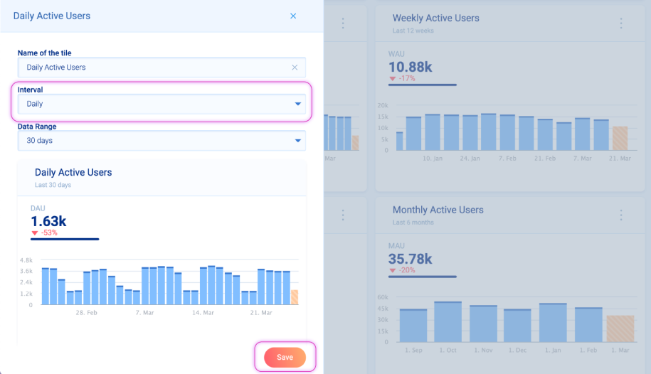
Each metric will provide you with insight into how many users visit your app at a given time. As you already know, the first days of user interaction are the most critical. This is why keeping a close eye on the DAU, WAU, and MAU metrics is paramount.
Conversion rates
Developing your in-app conversion rate is vital for retaining users. Use events to measure the number of successful purchases (e.g., going through the paywall or purchasing a paid plan).
Spot different user behavior patterns by comparing 2 events:
- “Plan_purchase_success”
- “Plan_purchase_error”
Compare these 2 events by pressing Ctrl/Command, then selecting the events from the action sidebar. Additionally, view recordings to see how user behavior differs between the 2 events.
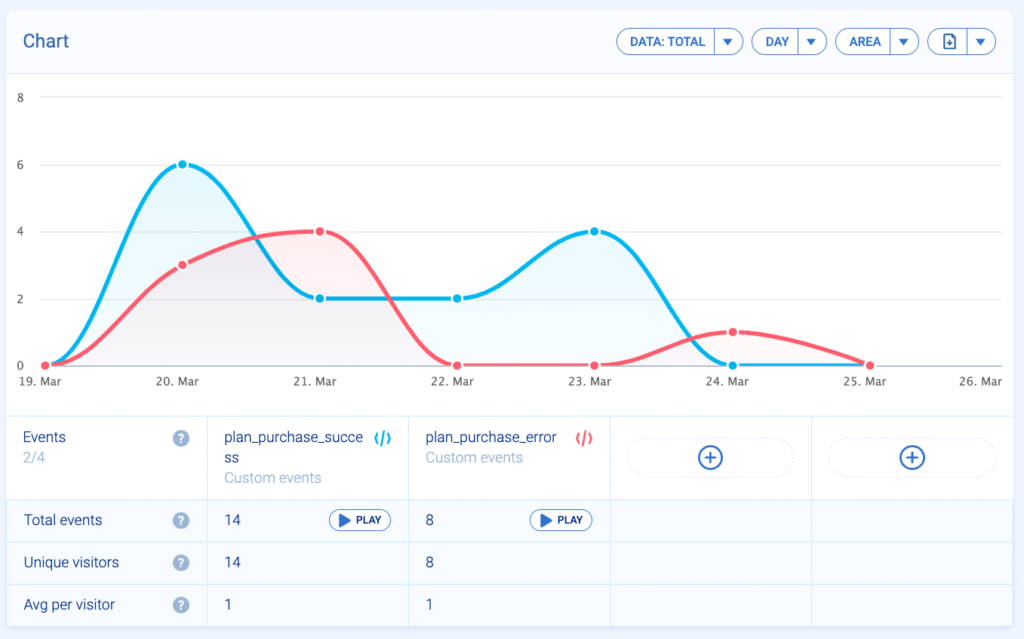
With event analytics, you can verify if the goal you set at the beginning of the onboarding flow is obtainable or if it needs modification.
Retention tables (cohort analysis)
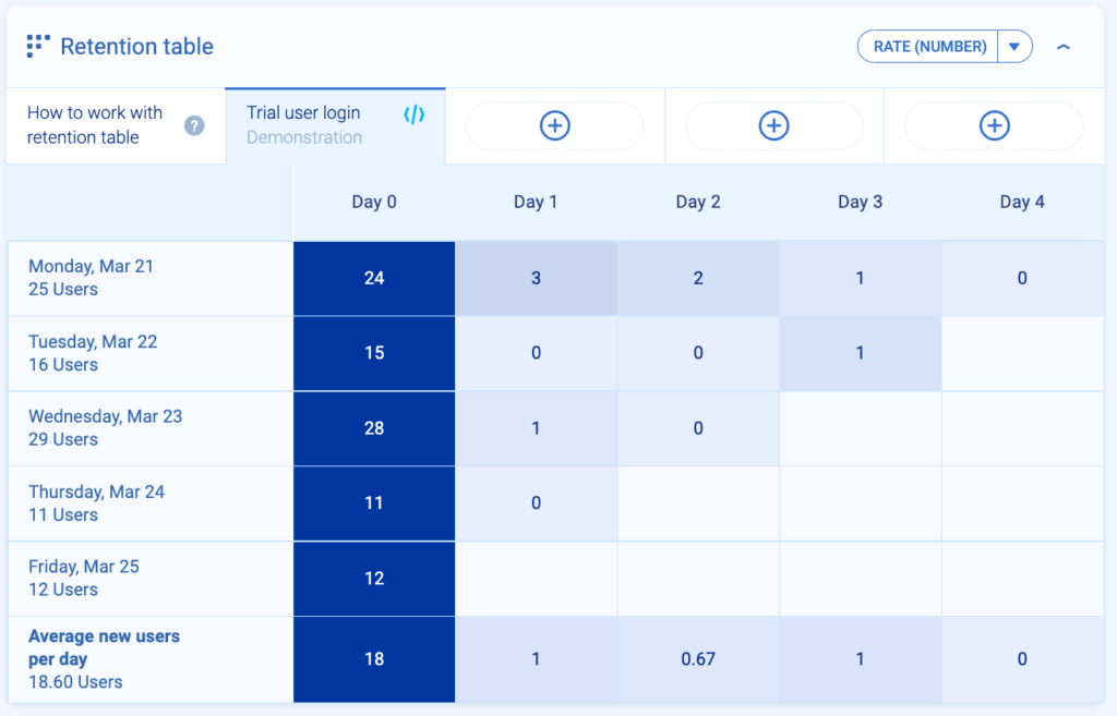
Retention tables show how groups of users perform a specific action over time. The data in the columns depict the number of users who perform an action day by day.
Using retention tables, check how many users log into your app in the first critical days. You’ll be able to see if your mobile onboarding process provides a good user experience. If it does, they’ll want to continue using your app.
To create a retention table, you have to define an event or create a custom event via API. Here is an example of the retention cohort of the event “Trial user login.” On Monday (day 0) 24 users logged in. But on day 1, only 3 users out of 24 logged in.
Never stop optimizing the customer onboarding process
As you remember, the mobile app landscape is saturated and competitive. Offer a great app to your user base and polish the mobile onboarding experience constantly.
Here is a short recap of everything you need to know about onboarding psychology:
- The timing of every element is crucial. Before they trust you, don’t ask users for too many favors (notification settings, paywall screen, long forms). Never ask for reciprocity if you didn’t give your users anything beforehand.
- Be as specific as you can. Vague language, weasel words, and unclear communication make users feel confused and unwilling to continue onboarding. Be very specific, don’t use any dark patterns, and reassure your users that they made the right decision by choosing your app.
- Take advantage of user information to create user groups and personalize in-app screens. If you ask new users for a lot of information, then serve them generic screens afterward, they won’t trust you. Be wise about collecting data and using it ethically to help users solve their problems.
Lastly, listen to user feedback and check your analytics data often. This approach will help you design a delightful mobile onboarding experience that users trust. All in all, your app success depends on giving your users a great onboarding experience.


