Mobile conversion rate optimization is a hot topic. This doesn’t come as a surprise — what mobile business doesn’t want to boost their revenue?
There are many ways to optimize your conversion rate on mobile devices. But be aware, not all methods are equal. Some are merely tricks that will only produce short-term results. Others require more time and effort but are more sustainable in the long run.
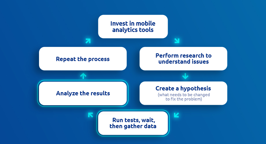
Although the path you choose is yours to follow, we recommend the longer route combined with a solid CRO strategy for best results. By the end of this article, you’ll understand what a reliable CRO framework consists of and how to get it right.
Note, this article focuses on smartphone apps not mobile sites or web pages.
Table of contents:
What is mobile conversion rate optimization (CRO)?
9-step plan to increase mobile conversions:
- Invest in reliable mobile analytics tools to help with CRO
- Before improving mobile conversion rate, do the research
- Create an initial hypothesis
- Run tests and analyze the results
- To increase conversion rate on mobile, increase user intent and motivation
- To boost mobile conversion rate, ensure a great onboarding experience
- Offer a solid UX and eliminate any points of friction
- Improve mobile conversion rate by analyzing crash reports and removing bugs
- Track cross-platform by combining mobile and website tracking
Bonus points:
Note: If you already understand the basics of mobile CRO, feel free to skip to the 9-step CRO plan.
What is mobile conversion rate optimization (CRO)?
Conversion rate optimization refers to tactics that aim to increase the number of users who perform a specific action in an app. Mobile CRO is sustainable as it enables you to increase your revenue without increasing acquisition costs. It also assists with lead quality and brand awareness.
Mobile CRO allows you to increase the number of:
- Subscribers
- Items a user can add to the cart
- Flights booked
- In-game purchases
- Charity donations
And those are just a few examples. Depending on your business goals, the sky’s the limit.
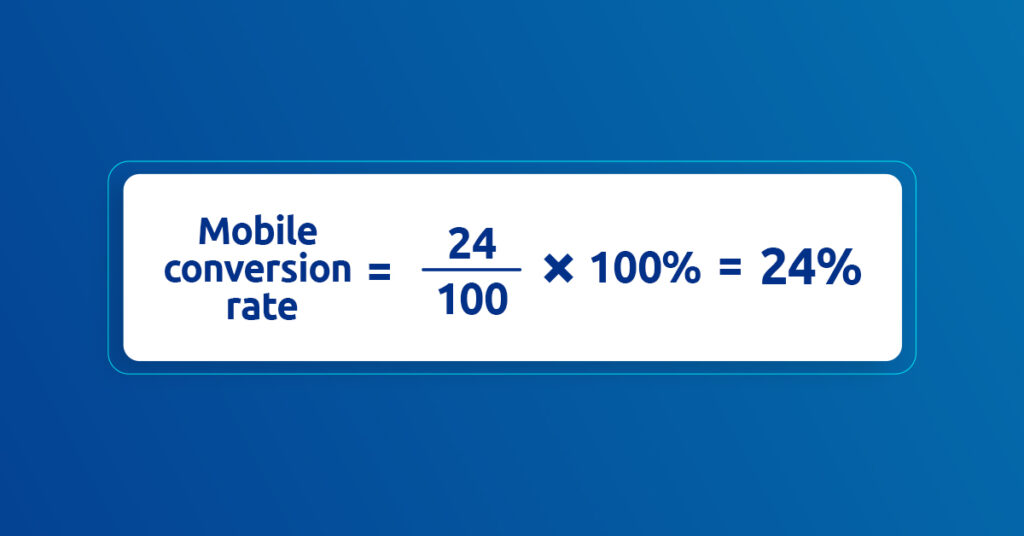
To calculate the mobile conversion rate, you’ll need to determine the number of users who performed an action. Then divide that number by the total number of users.
For example, let’s say 24 users out of 100 added an item to the shopping cart and purchased it using your mobile e-commerce app.
What are in-app micro and macro conversions?
It’s essential to know the difference between micro and macro conversions. Not all mobile conversions are equally important.
- Micro conversions: Less important conversions that indirectly influence revenue. For example “add to cart” or “sign up for our newsletter.”
- Macro-conversions: Conversions directly tied to revenue, including “purchase” or “request a demo.”
CRO focuses on macro conversions as they directly influence revenue. But if you see an opportunity to optimize micro-conversions with minimal effort, go ahead and do so.
9-step plan to increase mobile conversions
If you’re serious about mobile CRO and you have the patience that goes along with it, you’ll increase your revenue in the long term. When conversion rate optimization is done right, it’s a more affordable strategy than acquiring new mobile traffic (primarily through paid channels).
Let’s start with your mobile CRO framework.
1. Invest in reliable mobile analytics tools to help with CRO
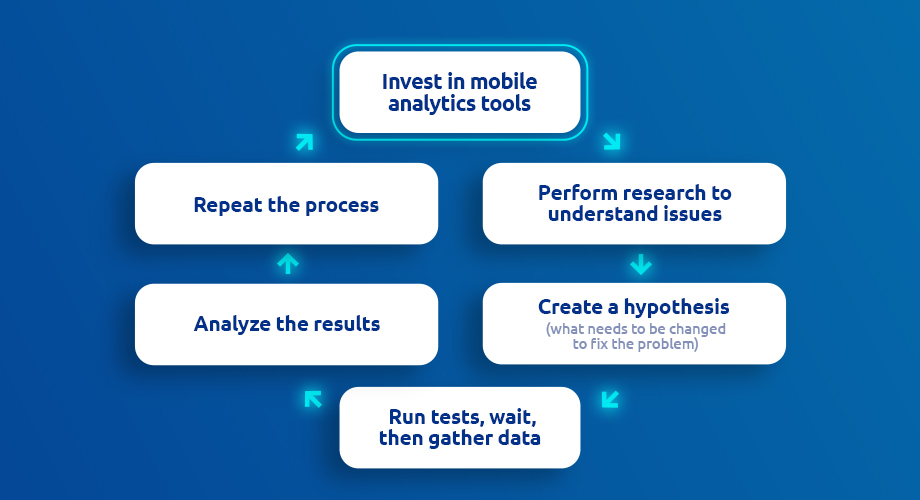
Analytics are critical when it comes to optimizing mobile conversions.
With behavior data insight from mobile analytics, you’ll understand:
- How users engage with your app
- Do they skip big buttons?
- Do they tap tiny links?
- What are users clicking on the most?
- What never gets clicked on?
- Are there any rage clicks?
- What exactly are users doing with your app?
- What paths are most common?
- Any funnel anomalies?
- Which screens experience the most significant drop-off?
- Are any bugs or crashes occurring?
If you don’t have any analytics tools, click here to compare 11 of the best free and paid mobile analytics tools of 2022.
Mobile analytics rely on software development kits (SDKs). This consists of a set of tools and programs that integrate analytics with your mobile app. SDKs allow development teams to save plenty of time as they only need to install the pre-written code within your app.
Choose a mobile analytics tool compatible with your mobile app’s native architecture. For example Android, iOS, Flutter, Unreal Engine, etc.
Look for software that enables you to track every user and every event automatically. What’s more, bear in mind customizable data retention periods so you can conduct analyses over the long run.
Now it’s time to set up a tracking plan. This includes selecting KPIs, events, funnels, and reports. Click here for advice about the most important mobile KPIs to track.
2. Before improving mobile conversion rate, do the research
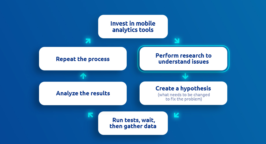
Instead of relying on a couple of tips and tricks that aren’t backed by any data or strategy, dedicate some time to plan. Remember, every new design requires time, money, and effort — don’t rely on a hunch.
Don’t rush it. Be patient when it comes to gathering analytics regarding mobile visitor behavior. In the meantime, start with basic questions, including:
- What problems is your app currently facing?
- Where are the problems located?
- What makes them problematic?
If you can’t answer these questions, don’t worry. Once you have access to reliable analytics data, you’ll have more user behavior information to answer those questions.
After your research is complete and you’ve collected your analytics data, it’s time to create a set of hypotheses. Some, you’ll accept, others you’ll reject.
3. Create an initial hypothesis
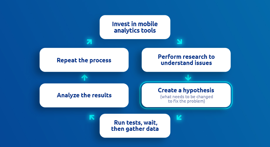
An essential part of a CRO framework involves creating hypotheses and conducting experiments. A hypothesis allows you to scrutinize an idea and connect it to the metrics you aim to affect. Also it’s a part of a/b testing process.
Let’s begin with an example:
Say you suspect that something is wrong with the user activity in your app over the last 7 days. Various users could successfully log in, whereas others had to contact support — they couldn’t activate their accounts.
To solve this riddle, you’ll need to create a hypothesis. For example: Fixing the login area will increase the number of logged-in users and the number of plan purchases.
By making adjustments to the login area, you’ll quickly know if your hypothesis is accurate or not.
4. Run tests and analyze the results
Now, let’s test how the login area is functioning. First, you’ll need to create an event-based funnel and analyze the recordings of users who gave up while trying to log into their mobile accounts.
You can see that the most significant drop-off rate indeed occurred on the login request step. Let’s see if this is something your users already reported to support. Review individual user recordings of the login request step.
It’s clear that the first user didn’t log in because they faced an error. Analyze the remaining recordings to determine if the same error is responsible for the other user drop-offs.
As it turns out, the same error was responsible for 12 of 38 users dropping off over the past 7 days.
After your development team corrects the issue, you’re ready to test your hypothesis: Fixing the login area will increase the number of logged-in users and the number of plan purchases.
Another example of mobile CRO comes from AstroPay — an online payment service. Take a look at how mobile conversion rate looked before the optimization.
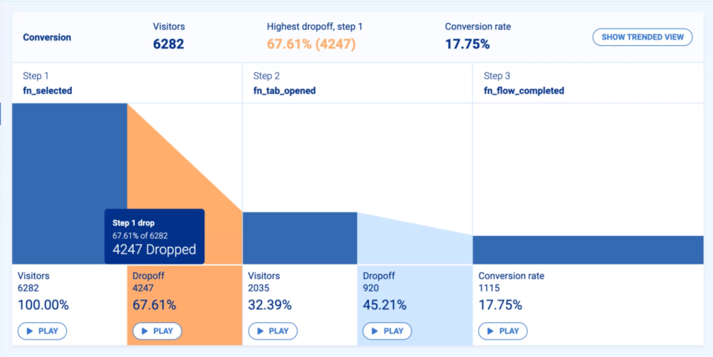
Despite having a short, 3-step purchase funnel, the crypto team noticed it was difficult for customers to complete it. They decided to make it one step shorter based on the mobile analytics data.
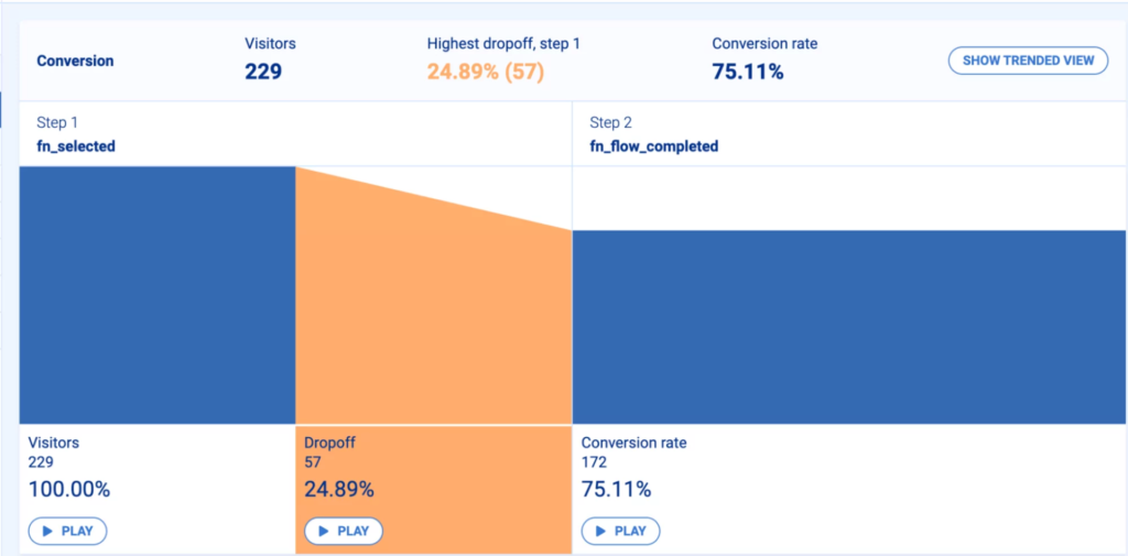
As a result, their drop-off rate decreased from 67.61% to 24.89%. That’s a decrease of 42.72%.
Analytics data is critical when it comes to mobile conversion optimizations. However, other areas need to be addressed — let’s dive into them.
5. To increase conversion rate on mobile, increase user intent and motivation
Not every user has the same motivation when it comes to engaging with your product. According to the Growth Engineering blog, to achieve successful CRO, increasing user intent and ease of use (reducing friction) is paramount.
As a user navigates your flow, their intent changes over time. This could be due to poor UX, friction, or unusual patterns.
User intent refers to how much a user wants to convert. For example, if your app was recommended, a new user is more likely to try the app and convert.
Conversely, if a user stumbles upon your app, their intent is low, and they are less likely to convert. This is why understanding your user’s level of intent and designing your flows accordingly is so essential.
How to maximize user intent?
If users are dropping off at the beginning of your app’s funnel, your user intent is low. In this case, you need to do the following:
- Provide them with educational content to help them understand the value of your app
- Improve your copy so it’s clear and persuasive
- Determine user goals concerning your app
Now, let’s talk more about the user experience during mobile app onboarding.
6. To boost mobile conversion rate, ensure a great onboarding experience
A mobile app that doesn’t have enough active users is doomed to fail. To retain users, focus on providing an intuitive mobile app onboarding experience. With an excellent first impression, you increase the chances of user conversion.
Imagine you have a food delivery app. If users onboard quickly and find your app easy to navigate, they’ll stick around. If they can order food in 3 simple steps, your app provides them real value. In this case, it’s delicious food delivered to their door in 30 minutes.
Let’s look at another example. Vertigo Games analyzes its onboarding process to convert more users. If they encounter a high drop-off rate in one step of their funnel, they immediately analyze the problem.
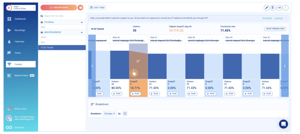
By pressing the “play” button at the bottom of the orange column, they can see what stops users from completing the onboarding process. Fortunately, it’s just a bug that can be fixed quickly to smoothen out the onboarding experience.
7. Offer a solid UX and eliminate any points of friction
A solid mobile app onboarding experience is one thing, but don’t overlook the overall in-app user experience. Remember, a great app with good UX will increase mobile conversions.
Let’s take a look at the mobile user experience hierarchy of needs based on Maslow’s hierarchy of needs.
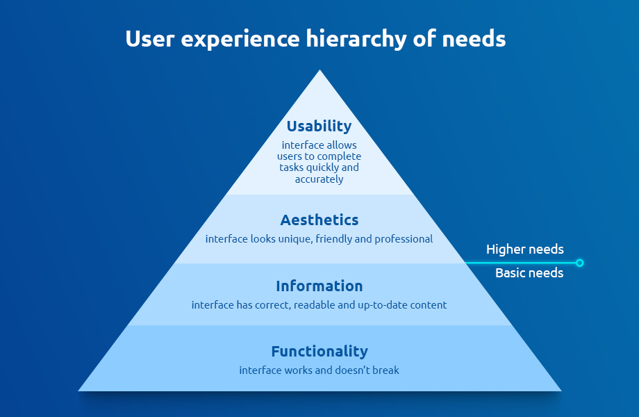
Users have a set of basic needs that have to be satisfied before moving up the pyramid. Focus on the inner workings of your app before focusing on aesthetics.
If you’ve already satisfied the bottom 2 steps of the pyramid, then it’s time to focus on the aesthetics of your UI. Whether users convert or not depends on what kind of an in-app experience you provide.
By striving to reach the top of this pyramid, step by step, you’ll drive more mobile conversions and recommendations.
The essentials of a solid mobile user experience (UX)
- Be minimalistic
- Include visible call-to-action (CTA). Favor buttons over the linked text
- Place important information above the fold
- Ensure your app is accessible to everybody — be inclusive and respectful
- Analyze crashes and remove bugs
What’s more, recordings offer a great view into user behavior. Default recordings will show you how users interact with your UI and buttons, including if they experience any bugs.
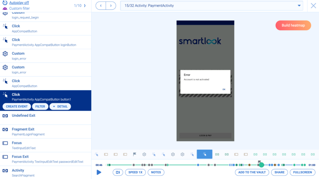
If you want to know how users behave before paying for a subscription plan, be sure to create a click event, e.g., “PaymentActivity.” Then, pay special attention to this event.
By watching recordings of various users, you can spot any problems they may encounter along the way. You can also press the orange button, “Build heatmap,” to generate a heatmap of a particular screen.
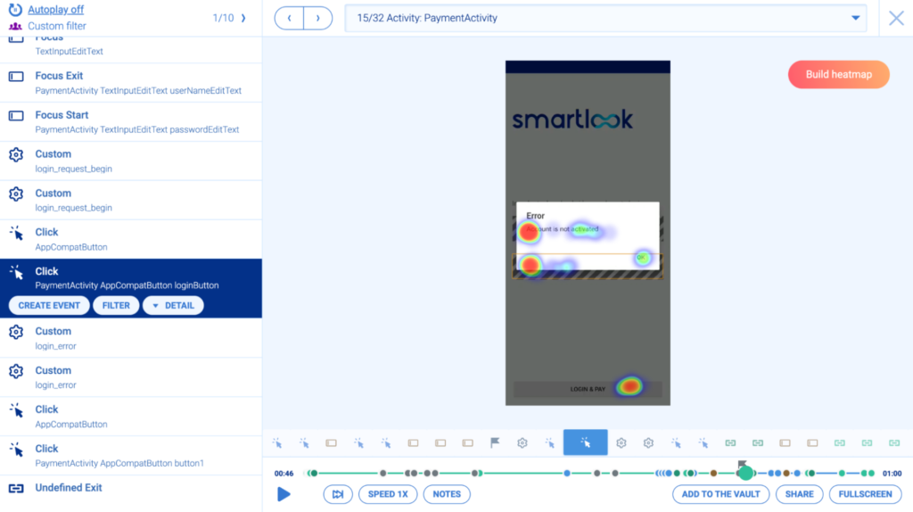
Heatmaps allow you to see which areas of the screen engage users and which they skip. Above, you can see that a user attempted to press the infobox multiple times as though they could not log into their account. This may indicate that they want more information regarding the problem.
Thanks to recording-connected heatmaps, you can easily spot and rectify user issues.
Do ethical mobile conversion rate optimization
Users can choose from hundreds of different apps. That’s why driving conversions in an ethical way is a good strategy.
How do you do it? Remove pop-ups and dark patterns that cause annoyance. Never ask your users for too much (especially if you didn’t give them anything initially). Study widespread app flows. Take note of their patterns and avoid patterns that confuse or trick users.
The way you communicate with your users is indirectly connected to conversions. By giving them the option to choose between notifications and app-based permissions, you provide them with control over their experience. Make sure you offer safe payment methods via PayPal or Apple Pay.
By following the rules of business ethics, you build rapport with your customers and gain their trust. This indirectly drives conversions as users always go with a brand they trust.
Improve your app performance
Your app’s performance plays a vital role in the overall user experience. No one likes an app that has a long loading time.
Your app’s speed will determine if your users stick around or not. In other words, whether they convert or not.
How to optimize speed:
- Ensure all images are optimized for size
- Enable asynchronous loading and caching
- Don’t load too many resources (scripts, CSS files, etc.)
Experiment with form fields
Users rarely like to fill in forms. This is especially true when it comes to mobile forms — it’s more problematic to fill in everything on mobile.
You can boost conversions by providing users with auto-filling forms (or short forms). Declutter your UI, so users feel comfortable filling in forms.
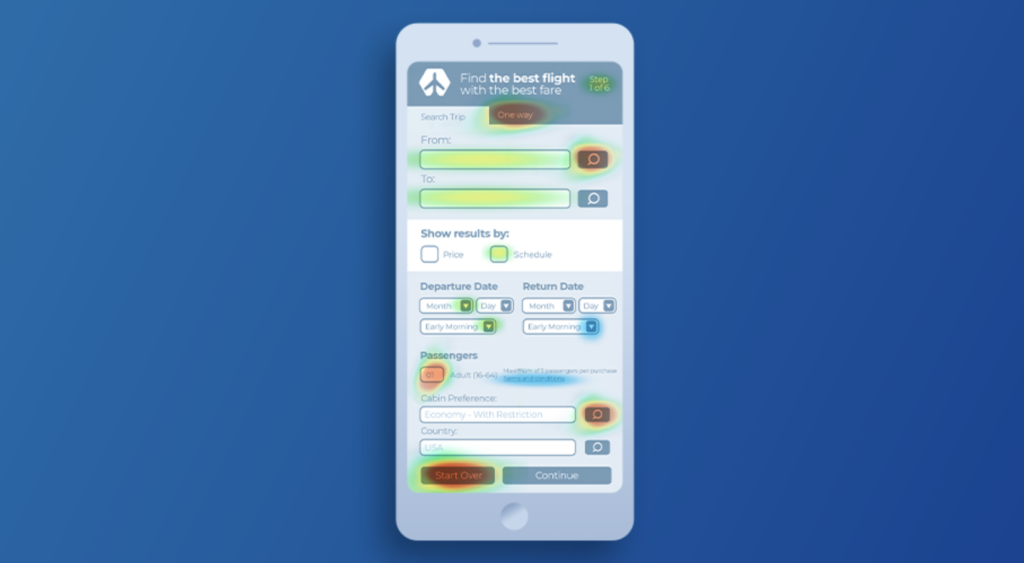
Create a mobile heatmap of the screen where a form is located to explore how it currently works. Watch recordings of how your users fill in forms and analyze their behavior. Pay special attention to where they often get stuck. Connecting heatmaps with recordings will give you a clear picture of how your forms work and if any improvements are required.
The length of a form is up to you. Sometimes, it’s necessary to have longer forms and lower mobile conversions to obtain high-quality leads in your lead generation process.
A solid mobile UX means fewer bugs (or none at all). More about this to come.
8. Improve mobile conversion rate by analyzing crash reports and removing bugs
Mobile apps that are bug-free offer a better user experience. That’s why mobile crash reports are so important.
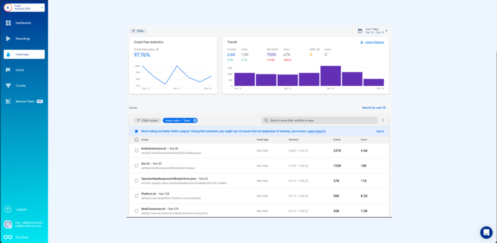
We’re releasing a crash report feature that helps you spot what causes a crash by watching recordings in the moments leading up to a crash. This feature allows your QA and development team to save time analyzing and reproducing the problem.
If you proactively solve user problems, they’ll continue using your app. A good experience will trigger more conversions and positive reviews in mobile marketplaces.
See how our client Fitify uses Smartlook to improve their UX and uncover any problems their app faces.
9. Track cross-platform by combining mobile and website tracking
If your mobile app has a web version, consider analyzing the entire funnel. By tracking how desktop users move to the mobile version, you’ll get a good idea of how you should optimize both website and mobile experience.
This is especially valuable for businesses that want to improve e-commerce conversions in the newly created app. By looking at the complete funnel, you can detect where the friction in the checkout process is coming from.
If a mobile user encounters an error while completing a purchase, then returns 2 days later (on your website) to manage the purchase, you’ll know there’s a problem with your mobile funnel.
Bonus point 1: sell to your best-match customers
The cycle of an average customer might be long, and some customers may frequently ask for discounts. Instead of targeting long-to-convert customers, focus on the customers that are the best match.
These customers will understand and love your product immediately. They’ll promote your app to others and are less likely to churn. Learn to recognize the behavior patterns of your best-match customers. Then target them with tailored communication.
Bonus point 2: Carry out qualitative surveys and usability testing
Mobile analytics is vital, but without qualitative data, it’s challenging to optimize for conversions. That’s why you should conduct customer surveys and interviews. They enable you to understand what users think of your app — what their problems and challenges are. By communicating with your users, you’ll learn what your business offers compared to others.
Don’t forget to organize usability testing sessions. These allow you to scrutinize your app’s usability and uncover issues that may have slipped under your radar. You’ll learn what your users think of your app and purchase funnels. Combine usability testing with session recordings to get the big picture regarding in-app behavior.
By examining the why, you’ll better understand how to improve app conversions in the long run.
Get Smartlook and boost your mobile app conversions
You’re now armed with a 9-step mobile CRO plan. Get inspired by our examples and adjust them to your business goals.
Remember, these examples aren’t suited for all cases. You’ll need to test, re-test, then test again. If you notice that something works, go with it. Just be sure that you’re making your decisions based on qualitative and quantitative data.
Try Smartlook for native mobile apps to get started today — see the pricing or create your free account now (no credit card required).


![How to increase your mobile conversion rate using analytics [9-step plan]](https://hpassets.smartlook.com/wp-content/uploads/sites/2/2023/02/10171916/1202066363083580-smartlook-1200x628-en-2.01.jpg)


