The hard part is figuring out what to remove.
What parts of your website are important to you but not to your visitors? Heatmaps can help you determine this.
An innovative company needs website heatmaps
Sewio is a pioneer in a new market. They manufacture real-time locating systems (RTLS) which are used to track people and assets as they move through indoor facilities.
Their customers use Sewio RTLS in industrial environments to track material flow, moving forklifts, or personnel. However, their technology is also used to track athletes, go-karts, and livestock.
And like any modern company, Sewio has a dedicated marketing team focused on improving conversions.
How Smartlook’s website heatmaps turned out to be a first step towards improvements
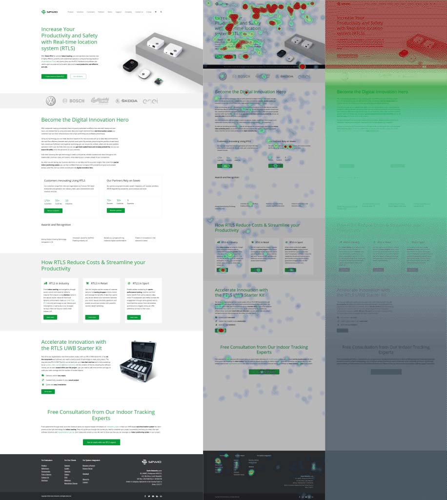
The first step towards improvement is to collect data. Sewio used Smartlook’s heatmaps to achieve this. Check out how the page initially looked and what the heatmaps showed.

What Sewio learned about their homepage from their website heatmaps:
- The buttons in the hero section are below the fold. Some people may not be able to see them
- Almost no one clicks on the client logos linked to customer success stories
- There’s a 30% visitor drop-off rate between the logos and subheadline — which signals that people perceive it as a false bottom
- You can see a significant visitor dropoff rate in the “Become the Digital Innovation Hero” section where no links are present. It looks like people are not interested in it (this section can be removed)
- Very few people click on the customers and partners boxes and almost no one scrolls through the free consultation section
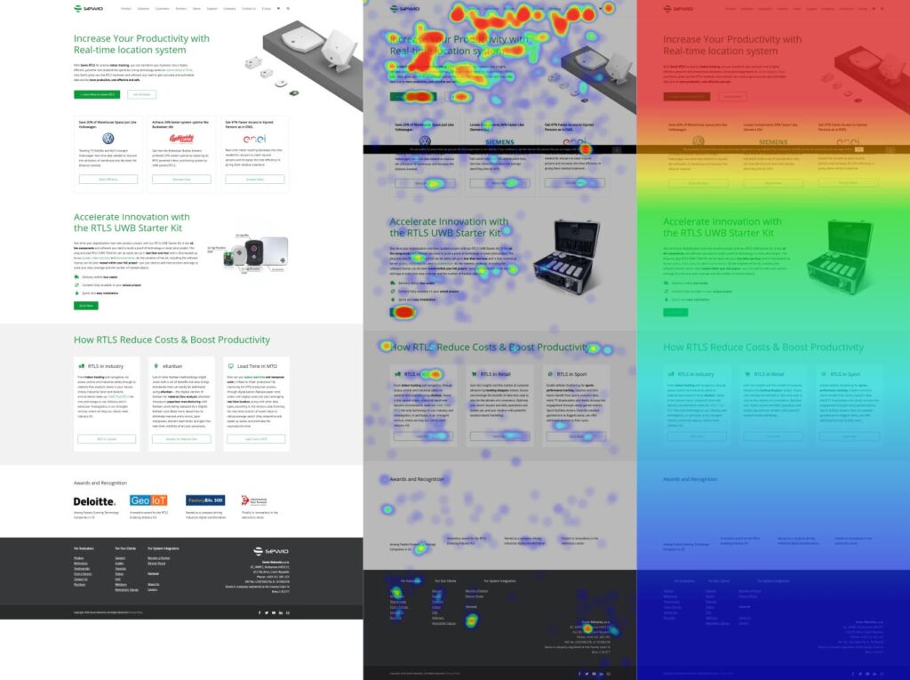
Armed with these insights, Sewio set to work making changes. They cut sections that weren’t attracting visitors. They moved primary call-to-action buttons above the fold. Also, they revised the section linking to customer success stories.
Now their webpage is jam-packed with enticing copy and buttons that make it clear where you can click.
This is how their webpage looks now.

Sewio achieved better e-shop visibility and customer references
And these are the results:
- Go to store button clickthrough is now at 276 %
- People click on the success stories links 3,1x more
- Average time on page went from 4:01 to 4:29

So, what does the company have to say about the results?
“With the insights from Smartlook, we’ve achieved our goal of increasing the visibility of our e-shop and customer references. This has helped increase the overall business efficiency of our homepage,” says Petr Passinger, CMO at Sewio.
“Smartlook became an integral part of any upcoming website updates – preceding and completing any of the changes we will make in the future. Witnessing the results sold us on the idea of using Smartlook.”


